Loren Brichter's New Game, 'Letterpress'

2012-10-24_104616.jpg

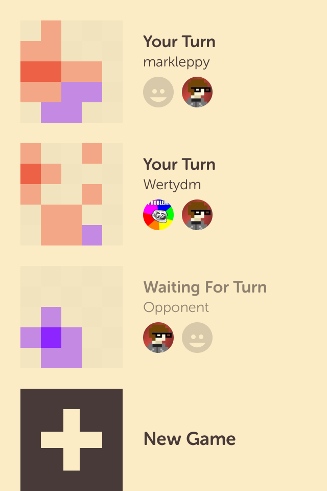
Loren Brichter, creator of Tweetie (now known as the official Twitter client for iOS), is back to developing apps independently. Today, he has released a new game called Letterpress for the iPhone and iPad.​

image.png
image (1).png

(note: both of these screenshots display the 'Retro' theme and not the default 'Light' theme)

It looks a bit like SpellTower, but the mechanics are totally different. The object of the game is to take turns with another player, creating words on a 5x5 board of letter tiles. As each player creates words, letters on the board are highlighted in their respective colors, until either the entire board is colored or both players have passed their turn in a round.​ The biggest difference between this and SpellTower is that you can create words using letters that are not connected together in any way.

The rules as explained in the app:​

  • Words must have at least two letters.
  • Words may only be played once.​
  • Words may not be a prefix of a previously played word.​ For example, if Player 1 plays the word "QUILTS", Player 2 cannot play "QUILT" (but "QUILTED" and "QUIT" would both be fine).

​The sounds and animations in the app are charming, the asynchronous nature of the online multiplayer makes it easy to pick-up-and-play whenever you feel like it, and even the typography is pleasant.

The game itself is free, but you can also unlock the full version for $0.99 within the app, which allows you to have multiple games going and also unlocks the other themes. I definitely recommend this game.​

Letterpress (App Store Link)​

Update: MacStories did an interview with Loren, wherein he described how he created the sound effects used in the game. Not what I expected.

'Implementing Smart App Banners'

appbanners.png

Helpful tip by David Smith, ​showing web developers how to show an iAd-style banner at the top of their mobile sites that point to their companion app, rather than using a popup message that has to be dismissed.

That’s it. Anyone visiting your site will now get this clean and context aware banner. If you are an app developer please take the 2 minutes needed to implement this. Gaudy popups promoting your app were detestable before but are now downright inexcusable.

Hopefully more companies will start using this method of advertising and quit doing this:

2012-10-10_160410.jpg

My Experience with iOS 6 Maps

2012-10-04_132554.jpg

People have been piling onto Apple lately over the whole Maps debacle, but I wanted to give it some more time on my own before I came to any conclusions. After taking a trip out-of-state and relying entirely on Apple Maps throughout, this is what I've come up with in terms of odd behaviors:​

  • At one point, when I asked for directions from my current location to a restaurant, it displayed the green pin for "Current Location" in an entirely different place from my actual location, marked by the little blue dot.
  • Siri likes to give weird directions, even going so far as telling us to make a u-turn further down the street when we're already pulling into the parking lot of our destination.
  • You can't scroll around map during turn-by-turn, like you can in Waze. You have to tap the screen for the controls to appear, tap the "Overview" button, scroll as needed, then tap "Resume" when finished scrolling. I'm very much a visual person, and I like being able to see the different turns that may be ahead of me, so I have a better idea what lane to be in after each turn.
  • When approaching a toll zone on the turnpike, it kept ordering me to "stay to the left" even when I was supposed to temporarily exit so I could pay the toll. Obviated by common sense of course, much like many of these other issues, but I could see this getting some people into trouble.
  • I had to submit an error to Apple because our hotel was entirely missing. It simply could not find it by name or display it on the map, although I could type in the address and that worked.

Overall, I think that Apple Maps is a good experience, albeit with the quirks that one might expect from a new service that absolutely depends on user input. The map data is obviously not going to be at the same level as Google Maps for a while, but with hundreds of millions of possible corrections being submitted to Apple all the time, people will eventually get over their initial hatred of the service.​

​I love the new vector graphics, they're much cleaner than Google's old map tiles. The turn-by-turn stuff is well-designed too, and when it works, there's no smoother experience in my opinion. Just wait until the data is there to back up the beauty on the surface, and Google will finally have a competitor in the mobile maps space to contend with. At least one worth talking about, that is.

A "Review" of Felix for App.net

2012-09-25_172359.jpg

I'm not an App.net (ADN) user. I've definitely considered becoming one, considering Twitter's behavior lately, but I'm still having trouble justifying the $50.​

​With that said, I've been hearing a lot about a new iOS client for ADN called Felix that just released today, and I thought this would be a good excuse to analyze some of the app's design from the perspective of someone who has no idea what using ADN is like.

Let's take it screenshot-by-screenshot.​

mzl.okthxjbj.320x480-75.jpg

This is what I assume is the main screen in Felix, basically equivalent to a Twitter timeline. Initial reactions:

  • The font choices are okay I guess, nothing special. Not sure I care for the cream-colored background. The actual ADN website has a textured gray background and white posts. If I were making a mobile client of that site, I'd probably stick with their color choices to make it seem more integrated.
  • Something about having drop shadows under every avatar irks me a little.
  • ​I can guess that the first two icons on the toolbar at the bottom are equivalent to 'Timeline' and 'Mentions' but I have no idea what the other three are for. The middle icon is highlighted blue in every screenshot, no matter what part of the app you're in, so perhaps it's a 'Compose' button. The globe icon might be a mobilized form of the public global feed, which is fine I guess but they could've used a better icon. The last icon looks like a speedometer which makes no sense to me.
  • Each post has several actions that can be performed. The arrow button is probably a 'reply to this post'​ feature, but what is the speech bubble for? Maybe that's really the reply button and the arrow button is used for sharing a given post? The recycle icon is likely a 'retweet' equivalent, and the star icon is obviously an 'add to favorites' function.
  • Seems weird and cluttered, having all of those icons inside every single post. Would be better to go the Tweetie route by swiping a post left or right and seeing the actions behind it, or the Tweetbot method of tapping a post and having a tray of options slide out below it.
mzl.hvorhhul.320x480-75.jpg

I guess this is where the speedometer icon takes you. It's obviously a details screen for a specific post in this screenshot, but what happens if you're looking at your timeline and tap that icon? What does it do then? On its own this is a confusing icon choice.​

mzl.brwckfyt.320x480-75.jpg

The 'compose' screen. The auto-complete hashtag bar in the middle is reminiscent of Tweetbot to me. The top toolbar is a bit weird.

  • The 'x' button is probably meant to cancel the post, but I can't tell what the drawer icon next to it is for.  Perhaps an upload button of some kind, but what would anybody be uploading aside from photos, which the camera button is clearly for?
  • The paper airplane is probably the 'publish' button but it's an odd choice over just having a button that says 'Post' or something. Maybe I'm weird, but it just looks like a "Send to Sparrow.app" button to me.
  • The character count should probably be moved down to the middle bar (on the right-hand side of course, so as not to interfere with the hashtag auto-complete).
mzl.mpdipvgq.320x480-75.jpg

Don't have much to say about this one. The star button at the top right is interesting, can you favorite entire conversations on ADN? The colors of the posts (the blue being your own posts and the green being people you follow?) are similar enough that they're hard to differentiate​, to my eyes.

mzl.ftwfohhl.320x480-75.jpg

Ohhhhhh, I get it. The speedometer icon means 'dashboard'. Clever. I notice that there's an option to see your starred conversations, so I guess I was correct about that last screenshot. I would say that on this screen, it's okay to have a drop shadow under your avatar since it's meant to stand out. Still doesn't make sense on the timeline, though.​

Overall, this seems like a nice app, but there are some weird UI conventions going on. Obviously, this is v1.0 so it should only improve from here, and maybe if the developer reads this post they can understand what a new user might think when they first look at the app.

Either way, it's a fun thought exercise. I recommend that other app developers do this for apps they know nothing about too, so they can put themselves in the shoes of their own first-time users.

If you're on App.net and would like to try Felix out for yourself, it's $5 on the App Store and works with both iPhone and iPad.​

iPhone app "Word Lens" translates languages on-the-fly via camera

There are days when you come across something cool and you think, "Wow, we really are living in the future!" I got that feeling today because of a new iPhone app called Word Lens.

What the app allows you to do is point the iPhone's camera at text in a foreign language, and it will translate that text into your native language in real-time and transpose that information where the foreign text used to be. It's a bit hard to explain, so check out their promo video to see it in action:

Pretty neat, huh? What's even nicer is that the app itself is free, but you will have to pay for language packs via in-app purchase. Currently the app only has language packs for Spanish-to-English and vice versa (both of which are 50% off until Dec. 31st, 2010) but they are sure to include more in the future.

There are also some other fun built-in features if you don't feel like buying any language packs at all, such as the ability to take the text you're looking at and have it spelled backwards.

The developer (Quest Visual) gives a disclaimer in the app's description that this technology is not perfect and is meant to be used only on clearly-printed words instead of someone's personal handwriting. Still, this technology has huge implications for international communication and travel in the future. It could also be a very useful learning tool for you budding polyglots out there.