Review: Quotebook for iOS

Review: Quotebook for iOS
“Somewhere, something incredible is waiting to be known.”
– Carl Sagan

Sometimes when I’m browsing the web, or reading a book or article somewhere, I happen across a quote that strikes me in some way, and I feel compelled to save it somewhere for later. The reasons vary of course, but the most common one is simple: inspiration.

I’m not talking about the fluff you’d find on cheesy motivational posters, but rather genuine insight given to us by the great minds of the world. The kinds of teachings that show us how to be more than we are; that inspire us to achieve greatness.

1Password 4.2 Released

1password-4-2.jpg

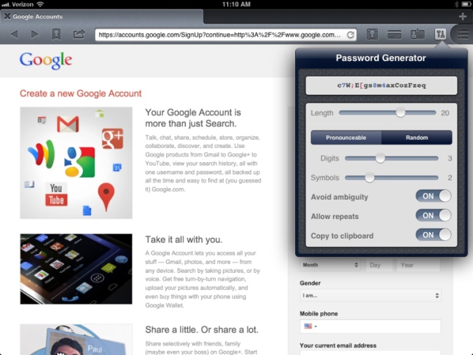
This is a pretty big update, if you're an iPad owner. Now you can generate passwords right from within the browser (they're calling it "1Browser" now), just as if you were using the desktop app.

They've also added 'Go & Fill' bookmarks to the iPad version, which really streamlines the process of logging into websites, saving you from having to go back-and-forth between 1Browser and the Vault.

The iPhone will be receiving both of these awesome features in a later update, but for now you can still use the other new goodies: the ability to share encrypted logins (be very careful with this) and advanced search functionality.

If you want to get the update now, click here.

Mophie Juice Pack Air

 MacStories recently featured a crazy-good-but-temporary deal: $15 for a refurbished Mophie Juice Pack Air for iPhone 4. If you're not familiar with the Air, it's a rechargable power case that allows you to essentially double your phone's battery life. Normally, these things go for at least $60 brand new, and we just happen to be going on a trip to Disney World in a couple weeks, so I couldn't pass this deal up.

In fact, I bought two of them; a white one for myself (I wanted a red one but they were sold out already), and a black one for my wife. They just arrived in the mail a couple days ago, and I wanted to share my thoughts so far.

'Conditions' Weather App

conditions.png

A lot of people have been talking about the latest simple weather app for the iPhone, Conditions. It's only a buck, so I decided to check it out for myself.

Right off the bat, I loved the interface. Very clean and minimal, which is exactly what I like in my weather apps. I don't require barometric pressure readings, nor do I need to have a list of various cities. Just give me a description of the current local weather and maybe show what the next few days will be like. That's exactly what Conditions does.

The typography is nice, the icons are charming, and there's even a nice little pull-to-refresh thermometer animation. Another nice touch is that you can simply tap the screen to dismiss or display the 5-day weather report. Very nice if you don't care about anything but the current temperature.

I think this will be my go-to weather app for a while.

App Store link

AT&T Allowing Facetime Over Cellular Network

Mark Collins, SVP of Data and Voice Products at AT&T:

"As a result of ongoing testing, we’re announcing AT&T will enable FaceTime over Cellular at no extra charge for customers with any tiered data plan using a compatible iOS device.

This means iPhone 4S customers with tiered plans will be able to make FaceTime calls over the AT&T cellular network. AT&T previously made FaceTime over Cellular available to customers with a Mobile Share plan and those with an LTE device on tiered plans."

As an iPhone 4S owner, I couldn't be more excited. It's about time AT&T did a good thing when it comes to their network.

Update: As noted by reader Jay Torres, this new rule doesn't apply to people still using their grandfathered unlimited plans from the old iPhone days. Didn't catch that on my first read-through of AT&T's blog post, so thanks to Jay for pointing it out to me.

(via Jim Dalrymple)

Day One Review

When it comes to New Year's resolutions, some people will often say something to the effect of, "Why wait for the new year? Just start right creating a habit rightnow."

While I understand where they're coming from, one can't ignore the simple power in the changing of years. Of course, we all know that it simply marks another revolution of the earth around the sun, and yet, the psychological effect remains profound.

It evokes a sense of sweeping away the old and bringing in the new. It helps us compartmentalize our successes and failures, making them easier to track throughout our lives. For those of us procrastinators who have egregiously passed on earlier opportunities to better ourselves or form new habits, the start of a new year can be a wonderful catalyst.

Cleartones

After Patrick Rhone linked to Cleartones over at Minimal Mac this morning, I realized that I have somehow never mentioned them here on Unretrofied. I aim to rectify that right now.

Cleartones is a set of beautiful, minimal ringtones and alert tones for iPhone and Android that were created by sound designer Hugo Verweij, who also runs the wonderful Everyday Listening blog.

I've purchased both the original and "organic" sets, and just before Christmas, Hugo was nice enough to release six extra tones recorded by a concert harpist, exclusively for existing Cleartones customers as a thank-you gift.

The pricing works this way:

  • $10 for the ringtones pack from either set.
  • $10 for the alert tones pack from either set.
  • $17 for the ringtones and alert tones combo pack from either set.
  • $30 for the entire collection of tones from both sets.

Alternatively, you can "pay with a tweet" for either set to receive two ringtones and two notification tones. This is a brilliant move on Hugo's part, allowing you to try out the product in exchange for a little free advertising.

I highly recommend these tones, and hope you'll check them out. I'm sure you'll like them too.

Review: Twitterrific 5 for iPhone

twitterrific.png

For quite a while now, I've been a dyed-in-the-wool Tweetbot user. I've tried just about every major Twitter client out there over the years, but for me, nothing ever really came close to the experience produced by the guys at Tapbots. Until recently, it had a permanent slot on my iPhone dock.

Well, nearly two weeks ago another contender entered the ring: Twitterrific 5. I took this as an opportunity to do an experiment. I've grown perhaps too comfortable with Tweetbot, so I decided to remove it from my phone entirely while I gave Twitterrific 5 a shot, thereby preventing me from succumbing to temptation and switching back at will.

Before I get to the review, I should briefly discuss the history of Twitterrific. The original Twitterrific was the first Twitter client to be released for the Mac. The later-released iPhone version was a landmark in app design, in fact the winner of an Apple Design award in 2008. It originated several Twitter conventions we now take for granted, including the use of birds in its imagery, the word 'tweet', and even the character counter displayed while composing tweets. You can view a timeline of the app's UI progression here, put together by the developers themselves.

Up to speed now? Good.

With Twitterrific 5, The Iconfactory has overhauled the entire design from the ground up, and it's beautiful. I usually don't enjoy dark themes in apps because they tend to make me recall some awful, awful Winamp themes from my teenage years, but Twitterrific 5 pulls off the dark look very nicely. The use of various pastel colors on a black background creates a pleasant Star Trek vibe.

Even if I hadn't enjoyed the dark theme, the developers have graciously included a light theme that switches the background from black to white. There's a setting to auto-switch to dark mode at night, if that's your thing. Other colors (i.e. text) are unfortunately not configurable, but the app is surprisingly theme-able otherwise. There are five typefaces to choose from: Helvetica, Proxima Nova (my current choice), Signika, Museo Slab (my 2nd favorite), and Calluna. You can also change font size, avatar size, and even line spacing.

Animations are fluid for the most part. One standout is the pull-to-refresh animation, which features an egg hatching into a bird that flaps its wings as the timeline loads, then teleports into nothingness when finished. Some people have expressed distaste for this animation, but I find that it supplements the app's charm.

What I can't get over is just how simple it feels to get around in the app. Switching between multiple accounts is a breeze (simply hold down on your avatar for a couple seconds and the list appears), your lists are only a tap away, and the main navigation buttons (Home, Mentions, Direct Messages, Compose) are prominently displayed at the top of the screen for easy access. Tap to highlight a tweet, and you'll be presented with several methods of interaction, like retweeting or even translating the tweet. Tweetbot-like gestures have also been included: swipe right on a tweet to reply, swipe left to view conversations/responses.

There are all sorts of other tips and tricks I won't go into here, but they're all listed under [Settings > Help] if you want to check them out.

Twitterrific finally handles blocking correctly, as opposed to other apps out there. With most Twitter clients, if you block someone it won't remove their previous tweets from your timeline, it will only prevent future ones from appearing. In Twitterrific 5, blocking someone immediately removes all of their tweets from your sight. Not a feature I use a lot, but it's nice to see it implemented correctly for once.

Of special note is the new icon, designed by The Iconfactory's own David Lanham. I've been a big fan of his work for years now, so it's a pleasure to have one of his designs sitting on my iPhone's dock.

As much as I love the app, there are a couple issues to mention. While they nailed the fluidity of animations within the app, it still takes an oddly long amount of time to refresh the timeline or other pages. Tweetbot always felt nearly instantaneous in this regard, so the extra several seconds it takes for Twitterrific to complete the same actions is mildly irritating. I'm spoiled, I suppose.

Another oddity is that my DMs tab hasn't once displayed anything since I purchased the app. It's just an empty black screen, no matter how many times I refresh. I re-downloaded Tweetbot just to make sure I'm not crazy, but my DMs are indeed showing up there. Hopefully Twitterrific fixes this in a future update.

One last thing I should talk about is how this is definitely not an app for power users the way Tweetbot is. According to the developers, it was specifically designed to be a casual Twitter experience and power users would do well to stick with Tweetbot or something similar, especially if they like to manage their lists.

Lists are viewable in Twitterrific 5, but you can't edit them, create new ones, or add users to existing lists, at least not that I'm aware of. There are also no push notifications or "streaming" features, two things I know are already keeping certain users away. Doesn't bother me personally, though.

In conclusion, I would highly recommend this app to anyone but the most hardcore power users. What started as an experiment of going without Tweetbot for a while has turned into having a new favorite Twitter client in its place. It's a breath of fresh air in an otherwise overcrowded marketplace.

As of this writing, they're still having a 50%-off launch sale, meaning the app is going for $3. It's universal app as well, so it's basically a steal at that price. Go check it out.

New Flickr App for iPhone

This morning saw an update to Flickr's maligned and oft-ignored iPhone app. Until today, it was basically usable for browsing photos and maybe uploading here and there, but the experience wasn't all that great. With this new update though, Flickr has decided to bring their 'A' game.

photo 2.PNG
photo 3.PNG

Clearly the new UI has been inspired by Instagram, right down to the addition of photo filters. As popular as Instagram has become, I guess it was inevitable that Flickr would one day see them as a competitor.

While the old app was a big sluggish and weird, the new app is sleek, beautiful, and quick. Photos load nearly instantaneously, and scrolling through the gallery of recent uploads by my contacts has been a joy. The new photo filters aren't too bad either. This was my first test shot:

8267469428_1d776abd41_z.jpg

I only recently started getting back into Flickr after years of neglect, but it feels like I'm late to the party because I don't see as much activity going on around there as I used to. Of course, there are still a few remaining diehard fans who have poured years of their lives into the service, but the rest? Who knows.

Now, with this fantastic update, I can imagine lots of people returning to their Flickr roots and I'm honestly pretty excited about that. It's Yahoo's one killer service and I think it deserves a chance to stick around for a long time. It's certainly been the topic of discussion on my Twitter feed today, and I'm taking that as a good sign.

Either way, I'll certainly be spending even more time on the service.

'Rethinking the Lock Screen: A Counterpoint'

Both Jim Dalrymple and John Gruber have linked to this piece in the last week. Most of its points are perfectly salient, but I strongly disagree with this section:

"Additionally, the grabber itself is flawed. It contradicts the swipe left-to-right motion that is is embedded into every iPhone users muscle memory. By the time I remember I can swipe up from the right to access the camera I've already unlocked the device the normal way.

A better solution might be to add an option to have a permanent camera "notification" that looks and acts like a standard lock screen notification. Swipe left-to-right on the camera icon to go directly to the app. It could be located on the top half of the screen below the date/time bar and would be far enough away from the regular unlock control on the bottom so as to prevent it from being accidentally triggered.

This would be more consistent with how people dismiss the lock screen and have the added benefit of being less visually disruptive to the lock screen's aesthetic balance."

There's nothing wrong with the camera's current 'swipe up' mechanic.

  • It's unobtrusive.
  • It's very easily accessible since you don't have to stretch your thumb to reach it, which I would think fits with the idea of quickly accessing the camera, yes?
  • The user could be holding their iPhone in either landscape orientation and still easily flick the camera grabber with their thumb.
  • It makes swiping to unlock the phone that much easier since it requires less 'travel' than it did before the camera button was around.

I'm having a hard time believing that anyone finds it to be a confusing feature. In fact, turning it into a constant notification would seem more confusing to me. To a user accustomed to seeing notifications on the lock screen, this would probably look like Camera.app is literally always trying to tell them something when it's not.

While I think that there are useful things that could be done with the iPhone's lock screen, this isn't one of them.

Review: Fantastical for iPhone

2012-11-29_090610.jpg

I've used several different calendar apps on my iPhone (Agenda Calendar and Calvetica spring to mind) but haven't really found one I enjoy using.

Until today, that is.

Fantastical is an immensely popular menubar app for Mac that allows you to type out event titles using natural language. You can type "Lunch with Mom on Sunday" and it will brilliantly parse this information to create an event at noon on the nearest upcoming Sunday. Today, developer Flexibits is bringing this same functionality to the iPhone.

Simply Designed

Fantastical's lovely icon was designed by one of my favorite artists, David Lanham, and it has made the transition over to iPhone very nicely, although I could do without the staples at the top.

The staples also appear in the app itself:

2012-11-29_105511.jpg

These are the first of several mild skeuomorphisms seen throughout the app (another of which is the fake texture of the red bar). I mildly dislike the staples, not because of some irrational hatred of skeuomorphic design, but because I find them a little distracting. My eyes keep being drawn to them for some reason.

If you've been a user of Fantastical for Mac, you'll notice that the iPhone version isn't just the same interface being ported over. This app introduces a new feature called the DayTicker, which is the horizontally scrolling list of dates at the top. This can be swapped out for a month view at any time.

photo 1.PNG
photo 2.PNG

Tap any visible date and the DayTicker will scroll there. No matter where you end up scrolling, you can simply tap the red menu bar above to return back to today's date. When appropriate, each date is filled with colored "blobs" that indicate events occurring that day.

The blobs actually correlate with the length and calendar-type of each event, making it easy to quickly scroll through the DayTicker and still have a concept of what's happening on a given day. This way, you don't need to see any event titles to know that Wednesday is pretty much booked, or that a bunch of bills are due Monday (if you have a 'Bills' calendar like I do, anyway). Very simple yet effective design.

Another nice touch is the "ripped paper" graphic that denotes any gaps between days on the DayTicker.

So Animated

Animations within the app are very well done.

As you scroll back and forth in the DayTicker, the list of events below scrolls with you. Scroll the event list instead, and the DayTicker follows. It's all very fluid and synchronous.

When creating events, as with the Mac app, you simply type an event the way you would say it out loud. As you type, your words will "float" down into the event preview pane and change things on-the-fly (no pun intended) as Fantastical parses the information.

2012-11-29_105642.jpg

I'm writing this review on a Thursday, so notice that when I typed "tomorrow night" it automatically moved the event to Friday at 8pm. How awesome is that?

You don't even have to type if you don't want. Bring up Siri from the keyboard, say something like you would to a person, and Fantastical will still parse it just like it would the text version. I'm finding myself dictating more events than typing just because it feels more natural.

[Side note: The 'Show Details' button you see on the New Event screen simply brings up advanced options like you'd see in the default iOS calendar app, so there's no real need to discuss it at length here. Just know that it's available when needed.]

When you've finished creating the event by tapping the 'Add' button, the page folds up and flies into the background, merging with the DayTicker on the appropriate date. Another skeuomorphic design, but I can't see why this would bother anyone.

So What's the Catch?

Actually, there are very few negatives I've come across so far. The biggest one involves the DayTicker/Calendar transition.

Pull down on the DayTicker, and a month view will slide down over it like a window shade. To switch back to the DayTicker, my natural impulse is to swipe back up on the month view to send it flying back up where it came from, but instead you must swipe down again and the month view slides down and flies behind the DayTicker, which has suddenly appeared back at the top.

It's hard to describe this animation, but trust me, you'll know exactly what I'm talking about when you use the app. Something about it just feels...wrong, although it's nothing I can't get used to.

Another weird thing: I changed the colors of all my calendars to what I wanted them to be, but the DayTicker and event list wouldn't reflect these changes until I force-quit the app and restarted it.

Finally, if you tap the 'Help' menu under 'Settings', the two available options ('Tips and Tricks', 'Frequently Asked Questions') take you to webpages that haven't been completed yet. Would be nice if they had taken care of that stuff before releasing the app. Not that these sections are particularly needed, since the app is so simple to use.

The only feature request I have would be a way to change the calendar type while creating the event, but without having to go into the 'Show Details' menu. Perhaps a hashtag system (ex: #personal #work #bills)? If this type of feature already exists, I haven't found it.

[Update: I've been informed that you can add '/calendar name' (ex: /personal) to the event and it will change accordingly.]

Wrap Up

Fantastical is a lovely, easy-to-use calendar app, and it has quickly become my new favorite. Since it's on sale for a limited time introductory price of $1.99, I recommend picking it up right now. I think you'll love it.

Review: Apple's Earpods

2012-10-16_091803.jpg

​I haven't had a lot of luck with iPhone earbuds over the years. The inline microphone and buttons tend to break, which sometimes causes the right earbud to stop playing sound anymore. My right ear is apparently oddly shaped anyway because it's hard to keep that earbud from constantly falling out (which my left ear never has a problem with).

As for my most recent set, I left them at a hotel on accident. For the last couple months I've been entirely without any earbuds, instead relying on a set of mediocre Skullcandy headphones I inherited a while back. Once the iPhone 5 was announced, along with the alien-like Earpods, I figured it was about time to pick up a new pair again.

[Just to be clear: I'm not getting an iPhone 5, so I've purchased the Earpods separately. The 5 is nice but I'm not so impressed that I'm ready to ditch my 4S yet.]

I was especially encouraged by all the great reviews I had seen from people who found that the new earbuds stayed in their ears better. After picking up a pair the other day, I have to say, that's still not the case for me. Even with the new design, I have to angle the right earbud a certain way for it to stay in my ear, and even then it still falls out every once in a while. No fault of Apple's really, just something I have to deal with. I know I should probably just get some in-ear headphones to alleviate this, but I've never found a pair that wasn't uncomfortable after a few minutes of use.

Sound-wise, these things are a slight improvement over the old earbuds, but I wouldn't say they live up to the claims made by Apple during the iPhone 5 announcement keynote. The bass is a bit nicer but that's all I've noticed. I'm not an audiophile though, and they're perfectly serviceable for my needs.

I guess I would say my favorite part is, oddly enough, the new "clickyness" of the inline buttons. They actually feel like three very distinct and responsive buttons, rather than one big muddy-feeling button. The sound quality of the mic itself seems about the same as before but I haven't tried it in extremely windy weather yet. Since the mic is totally encased in plastic instead of having a little exposed hole, I imagine it will work pretty well.

​Overall, these are a decent set of earbuds but I think $30 is a tad bit much to pay for them. You can find earbuds of similar or better quality for much less. I just hope this pair doesn't break on me.

A "Review" of Felix for App.net

2012-09-25_172359.jpg

I'm not an App.net (ADN) user. I've definitely considered becoming one, considering Twitter's behavior lately, but I'm still having trouble justifying the $50.​

​With that said, I've been hearing a lot about a new iOS client for ADN called Felix that just released today, and I thought this would be a good excuse to analyze some of the app's design from the perspective of someone who has no idea what using ADN is like.

Let's take it screenshot-by-screenshot.​

mzl.okthxjbj.320x480-75.jpg

This is what I assume is the main screen in Felix, basically equivalent to a Twitter timeline. Initial reactions:

  • The font choices are okay I guess, nothing special. Not sure I care for the cream-colored background. The actual ADN website has a textured gray background and white posts. If I were making a mobile client of that site, I'd probably stick with their color choices to make it seem more integrated.
  • Something about having drop shadows under every avatar irks me a little.
  • ​I can guess that the first two icons on the toolbar at the bottom are equivalent to 'Timeline' and 'Mentions' but I have no idea what the other three are for. The middle icon is highlighted blue in every screenshot, no matter what part of the app you're in, so perhaps it's a 'Compose' button. The globe icon might be a mobilized form of the public global feed, which is fine I guess but they could've used a better icon. The last icon looks like a speedometer which makes no sense to me.
  • Each post has several actions that can be performed. The arrow button is probably a 'reply to this post'​ feature, but what is the speech bubble for? Maybe that's really the reply button and the arrow button is used for sharing a given post? The recycle icon is likely a 'retweet' equivalent, and the star icon is obviously an 'add to favorites' function.
  • Seems weird and cluttered, having all of those icons inside every single post. Would be better to go the Tweetie route by swiping a post left or right and seeing the actions behind it, or the Tweetbot method of tapping a post and having a tray of options slide out below it.
mzl.hvorhhul.320x480-75.jpg

I guess this is where the speedometer icon takes you. It's obviously a details screen for a specific post in this screenshot, but what happens if you're looking at your timeline and tap that icon? What does it do then? On its own this is a confusing icon choice.​

mzl.brwckfyt.320x480-75.jpg

The 'compose' screen. The auto-complete hashtag bar in the middle is reminiscent of Tweetbot to me. The top toolbar is a bit weird.

  • The 'x' button is probably meant to cancel the post, but I can't tell what the drawer icon next to it is for.  Perhaps an upload button of some kind, but what would anybody be uploading aside from photos, which the camera button is clearly for?
  • The paper airplane is probably the 'publish' button but it's an odd choice over just having a button that says 'Post' or something. Maybe I'm weird, but it just looks like a "Send to Sparrow.app" button to me.
  • The character count should probably be moved down to the middle bar (on the right-hand side of course, so as not to interfere with the hashtag auto-complete).
mzl.mpdipvgq.320x480-75.jpg

Don't have much to say about this one. The star button at the top right is interesting, can you favorite entire conversations on ADN? The colors of the posts (the blue being your own posts and the green being people you follow?) are similar enough that they're hard to differentiate​, to my eyes.

mzl.ftwfohhl.320x480-75.jpg

Ohhhhhh, I get it. The speedometer icon means 'dashboard'. Clever. I notice that there's an option to see your starred conversations, so I guess I was correct about that last screenshot. I would say that on this screen, it's okay to have a drop shadow under your avatar since it's meant to stand out. Still doesn't make sense on the timeline, though.​

Overall, this seems like a nice app, but there are some weird UI conventions going on. Obviously, this is v1.0 so it should only improve from here, and maybe if the developer reads this post they can understand what a new user might think when they first look at the app.

Either way, it's a fun thought exercise. I recommend that other app developers do this for apps they know nothing about too, so they can put themselves in the shoes of their own first-time users.

If you're on App.net and would like to try Felix out for yourself, it's $5 on the App Store and works with both iPhone and iPad.​

Review: 'Drafts' for iOS

mza_865247112103094350.png

Ever have an idea that suddenly popped into your head that was so good you needed to jot it down, but by the time you get a chance to write, you've forgotten what it was? Or do you have an idea that isn't yet ready for the big time and needs to be refined first? You need an app like Drafts.

​Drafts is designed to help you get your ideas out of your head into text form in the quickest way possible. When you open the app, it promptly greets you with a blank white canvas and a keyboard. No searching for previous notes, no need to add a title first, no distractions. Once you open the app, you simply start typing.

2012-09-25_085131.jpg

After you've finished typing, you can tap the '+' icon on the center toolbar and save it for later, or you can tap the 'Share' icon on the right side and export it to many different places, including Evernote, Tweetbot, SMS, Facebook, Reminders, Dropbox, ​Omnifocus, Sparrow, Agenda Calendar, and a lot more.

Drafts supports ​Markdown as well, if you're into that sort of thing. I've personally been using it as a tool for practicing Markdown on the go, since it includes options to preview the HTML output of your Markdown or send it elsewhere for use.

​If you would like to go back and see all of your previous drafts, just tap the 'paper' icon on the tool bar and the keyboard will slide down, revealing the drafts list underneath. There's no organizational structure that I'm aware of (like folders or tags), but if you need to find any specific thing you can just use the search feature (obviously, it's the magnifying glass icon on the toolbar).

​Drafts has become extremely useful for me, because I often have an idea spring to mind that I forget by the time I can get it into text form. I could just open Evernote and create a new note there, but Drafts feels so much more direct and I don't feel like I'm going to forget anything by the time it opens because it only takes a second or two.

With Evernote, I have to wait for the notes list to finish syncing, then tap the 'New Note' button, then tap in the body area to start typing. Those extra seconds really do matter, especially when you're doing those same things every single time you open the app. Plus, with Evernote, I'm tempted to properly tag and title each note when I'm done, but with Drafts I don't feel that compulsion. In this case, simple really is better.

There are plenty of other features in Drafts that I haven't even talked about here. For such a simple app, it's pretty powerful, and I highly recommend it. The iPhone version is $2 and the iPad version is $3.

Lightning and the Fight Against Change

2012-09-20_092915.jpg

By now, pretty much everyone knows about the new Lightning connector being used in the iPhone 5. As with any Apple announcement, reactions from most people (I wanted to use "customers" here, but apparently people who have no interest in the iPhone 5 feel the need to speak up about this too) have fallen into two extremes:

"Ah, this makes total sense. Of course Apple would do this, because it helps them create a much thinner phone, and they can do away with that lousy old thing."

and​

​"I CAN'T BELIEVE APPLE WOULD FUCK US LIKE THIS, WHAT AM I GOING TO DO WITH ALL OF  MY ACCESSORIES NOW?!"

​The latter reaction is both amusing and fascinating. This kind of thing seems to be a repeating cycle, although the average consumer seems to forget it. They forget that, years ago, Apple gave up the Firewire connector for the iPod (more specifically, the 3rd generation) and switched over to the 30pin connector we've been using for nearly a decade now. It was only a matter of time before Apple would move on to something else.

​Meanwhile, many of Apple's competitors have been using their own proprietary cables and switching them up even more often. Just look at Samsung, for example:

1347878869.jpg

These cables were all released in the time frame that Apple kept the 30pin connector in use. And this image doesn't even show all of them. Making Apple out to be the bad guy here is just ridiculous.

The other thing people are forgetting is that gadget cables are slowly becoming a thing of the past. Apple's AirPlay feature bypasses the need to connect your iOS ​device to anything else; you just tap a button on the screen and it works wirelessly. Even without AirPlay, everyday technologies like WiFi and Bluetooth are being implemented in interesting ways:

  • Sonos wireless music system
  • Pay With Square
  • Bluetooth connectivity in cars​
  • WiFi syncing with iTunes​
  • Over-the-air iOS updates​
  • iCloud backups​
  • Apps/books/podcasts can be downloaded directly to the device, no sync even necessary.

While not universal yet, wireless charging is also becoming more and more popular. Put all of this stuff together, and you have a device that rarely needs to be plugged into anything. Never before has an iOS device been so capable of being entirely independent.

As for the old accessories that ​everyone keeps howling about, I think there are still few reasons to complain. For one thing, at least Apple even created a Lightning > 30pin adapter for people to use, even if it's essentially an expensive piece of plastic. They could have done nothing of the sort and left customers to dry.

Which brings me to my next point. Nobody is being forced to upgrade to the iPhone 5, or any other Lightning-compatible device Apple is sure to release in the near future.​ You don't HAVE to buy this thing. Keep your iPhone 4S or whatever it is you have, and be happy that it works the way you need it to. It's certainly not Apple's problem that you bought all of these accessories that require the 30pin connector anyway.

​My guess is that this whole thing will blow over relatively quickly. Even the most ardent complainers will likely be on a Lightning-compatible device in the next year or two, and even then they probably won't use the cable all that much.

Rethinking a Jailbroken iPhone

As I tweeted yesterday, I've been considering just having a stock iPhone experience rather than jailbreaking anymore. I was mostly kidding about the 'OldManism' thing, but perhaps this really is a sign that I'm getting older and have lost patience with the tinkering aspect of owning a smartphone.

Life as a jailbreaker

I've been jailbreaking my iPhone for as long as I've owned one. I started on the iPhone 3G back in 2008, ​and continued doing so once I upgraded to the iPhone 4S earlier this year. I've spent quite a few hours scouring the internet—forget searching within Cydia, it's not at all designed for discovery—trying to find great stuff I could try out.

I was pretty big on themes at first. I probably used all the big ones at some point, but eventually settled on switching between Glasklart and Illumine every now and then. Once I discovered how to make Glasklart icons for apps that hadn't been added into the theme's repository​ yet, I spent far too much time doing so because I liked having a uniform experience.

I've also grown accustomed to certain conveniences:

  • biteSMS allows me to compose or reply to text messages from anywhere, even the lockscreen.
  • The lockscreen itself started out as basically a clock and wallpaper, and Apple has made it a bit more useful with iOS 5's Notification Center, but I can still do even more with it if I want, using something like LockInfo.
  • I always have easy access to toggles for wifi, volume, brightness, airplane mode, and more, using NCSettings (which replaced the beloved SBSettings on my iPhone a while back).
  • With SmallBanners, the top-screen notification banners used in iOS are smaller and less obtrusive.
  • With Folder Enhancer, I can put​ app folders inside of other folders on the homescreen. My folders are no longer limited to 12 apps, but instead are paginated much like the homescreen, and I can have as many pages as I want.
  • Cyntact alters my Contacts list to show peoples' photos next to their names. Why this isn't default functionality is beyond me.
  • NoNewsIsGoodNews hides that stupid NewsStand icon that I'll never use.
  • DataDeposit lets me save all data from any given app into a folder within my Dropbox account, where I can restore from later if needed.​
  • CallBar prevents an incoming call from overtaking your entire screen, and instead relegates it to a nicer notification bar at the top that you can swipe to answer.​

​​I could go on, but hopefully you get the idea. There are truly some great things available to jailbreakers*, and I'm hesitant to give it all up.

*I'd like to note that I'm not one of those people who jailbreaks in order to pirate apps. Those kinds of repositories have never touched my phone, and they never will. In fact, there are several apps I've purchased from Cydia, and if I stay jailbroken, I have a few more that I'm willing to buy. I don't mind supporting good development, whether it's happening on the App Store or in Cydia.

​There's always a catch

Unfortunately, jailbreaking has its downsides too. Near the end of my iPhone 3G's life, it would often take incredible amounts of time to accomplish simple tasks like opening the camera app (which actually made me nearly miss some good shots of my son in the weeks after his birth). I didn't mind too much at the time, because that's just what I was used to.

It wasn't until I upgraded to the 4S that I realized how stupidly slow my phone had been. And due to the timing of my upgrade, my phone was running a version of iOS that hadn't been jailbroken quite yet, so I actually was running a stock phone for a little while. Once that jailbreak was publicly released though, I figured that this speedier phone should be able to handle it much better than the old one had. I was right, and soon I was back to my old-but-improved setup.

The problem is, some of the same old issues are still bugging me constantly.

To explain, over the last few years I've developed a habit of avoiding any iOS releases that didn't seem important enough to mess with. Each time I updated iOS, I would go through this whole rigmarole of manually backing up all my more personal stuff (like photos and contacts), deleting certain packages from Cydia that interfere with iPhone restores (which I don't believe is a problem anymore, thankfully), trying to save my SHSH blob in case I wanted to downgrade to the older version of iOS later, restoring the phone, installing the new iOS, re-jailbreaking, putting all my favorite apps back on the phone, and setting everything back up from scratch.

Why did I put myself through all that? Well, there's nothing quite like starting with a clean slate. Everything just seems to run better that way (although I admit this could be a placebo effect).

An unfortunate side effect of all this is, while I'm avoiding iOS upgrades, app developers of course continue to push out releases that sometimes break compatibility with my version of iOS. I have several apps that no longer support iOS 5.0.1 (my current version) and I simply cannot update them until the phone itself has been updated to 5.1.1 first (or iOS 6, when it releases this fall).​

Another irritant lately has been that, as time goes on, my phone gets worse and worse about hanging on to login data for certain apps. I haven't done anything different with the phone lately, yet certain apps like Facebook, Tweetbot, and Reeder keep asking me to login when they never did before. Tweetbot specifically has a problem with losing other internal settings too, like which 'Read Later' client​ I want to use.

​Apple's email app has been degrading lately, too. Sometimes I'll open it, only to find a bunch of emails on the list being shown with the 'unread' badge, even though LockInfo shows that I only have one unread email. Besides that, all emails on the list are showing as not having any content. Like so:

​

The only way of fixing this email thing, along with the apps that are losing random settings, is to do a hard-reboot of the phone. I've gone from hardly ever having to do that, to doing it once or twice a day. Annoying.​

Where am I going with all this? Well, I think that when iOS 6 drops, I'm​ probably just going to do one more fresh restore and then keep it that way. I'm getting to the point where dealing with this shit is more irritating than not having all of those conveniences.

This is where someone might ask, "why don't you just get an Android phone?" I've had an iPhone for so long that I've become pretty entrenched in their ecosystem. I've spent a not-so-small amount of money on App Store apps, and I'm not just going to throw all that away. Plus, I plan on getting other Apple products someday, like an iMac and an iPad. Why wouldn't I just keep using the phone that works best within that framework?

After iOS 6 launches, I'll gather some thoughts and post what I think about the experience.​

An Experiment in Monochrome iPhoneography

 
​

​Lately, I've been feeling a little inspired to get back into photography. I know I mentioned in my last post that I might dust off the ol' DSLR (a Canon EOS 20D, if you care to know) and shoot with that, but right after writing that post, the family and I took a vacation and I hate carrying a camera bag around all day long. Instead, I decided that I was going to shoot exclusively with my iPhone 4S, and to make it more interesting, I was going to do a little experimenting with monochrome.

This is an experiment I've been wanting to do for a while now, especially after reading about the Leica M Monochrom camera, which ONLY shoots in monochrome. I have to admit, the Monochrom takes some incredible photos, but there is no way I'm putting down $8,000 even for a camera like that.​

Luckily, an app exists for iOS called Hueless, and it performs the same basic function as the Monochrom: it forces you to shoot in black & white. This isn't like applying a filter over a color photo, though. Photos shot in Hueless are truly black & white, with deeper blacks, crisper lines, and a relative lack of photo "noise" compared to, say, Instagram's black & white filter. And the app is only a couple bucks, so the price of entry is obviously much lower than buying the Monochrom.

Now that I'm back from that trip, I'd like to share some of the photos I captured, as well as a few things I noticed along the way (which will seem obvious to your average professional photographer, but I'm kind of self-teaching here so please excuse my amateur-isms).​

One of the things I first noticed i​s that this app is perfect for capturing sunrise/sunset silhouettes.

​1877 Elissa, a fantastic little cargo ship that has been (and is still being) kept up by volunteer workers.

​1877 Elissa, a fantastic little cargo ship that has been (and is still being) kept up by volunteer workers.

​It also performs surprisingly well in low-light situations. In most cases it's a much better alternative to using the iPhone's terrible built-in flash, which tends to make photos garish and unflattering.

​This one reminds me of Peter Pan, for some reason.

​This one reminds me of Peter Pan, for some reason.

​This was taken at night with only a nearby streetlamp providing light on top of what the moon was giving us. I was impressed with how well this turned out, even with the photo noise.

​This was taken at night with only a nearby streetlamp providing light on top of what the moon was giving us. I was impressed with how well this turned out, even with the photo noise.

Of course, when you've got some real light to work with, you can capture even better images. Reflective objects photograph especially well in monochrome.​

​
​
​
​I really wish I could have captured this statue without the person swimming in the background. You can't unsee it now, can you?

​I really wish I could have captured this statue without the person swimming in the background. You can't unsee it now, can you?

I absolutely love the way architecture (or any other large structure)​ looks in monochrome.

​Had to walk into the middle of a 4-way intersection to get this one. I don't necessarily advise this, but sometimes it's worth it to get the shot.

​Had to walk into the middle of a 4-way intersection to get this one. I don't necessarily advise this, but sometimes it's worth it to get the shot.

​Absolutely loved this coffee shop. Wish I could've brought it back with me.

​Absolutely loved this coffee shop. Wish I could've brought it back with me.

​
​Purposely-sunken ship. According to our boat tour guide, some guy once lived on this thing by himself for about 10 years without anyone knowing about it, growing his own food and raising chickens and everything. Crazy.

​Purposely-sunken ship. According to our boat tour guide, some guy once lived on this thing by himself for about 10 years without anyone knowing about it, growing his own food and raising chickens and everything. Crazy.

​Rocket boosters from the incredible Saturn V rocket.

​Rocket boosters from the incredible Saturn V rocket.

Black & white photos can show a surprising amount of detail (like lines and shadows) compared to their full-color counterparts.

​
​I can't shake the fact that this looks like the trollface guy from Reddit.

​I can't shake the fact that this looks like the trollface guy from Reddit.

​

Overall, shooting with Hueless seems like an easy way to make your photos "pop" in an interesting way. I wouldn't say it's a fix-all for every​ boring photo, though. Obviously, subject and composition still play a huge role in the shot, and sometimes it's just plain better to shoot in color.

Take this motorcycle, for example. I shot both a full-color version and a monochrome version, and I honestly find the color version more compelling visually:

​
​

[These photos remind me of the inherent limitations of the iPhone 4S' camera, even as capable as it is. For one thing, it's nearly impossible to adjust the depth-of-field the way I'd like.​ Had I been shooting with my DSLR, I certainly would have shot with a larger aperture in order to have a hazier background while keeping the foreground in focus. Not a huge deal, but something to keep in mind if you plan on shooting with just about any smartphone camera, as of this writing, anyway.]

I shot two versions of this ​engine-order telegraph as well, and also found the color version more interesting.

​
Almost looks like an Instagram filter, but this is just how the iPhone shot it.

Almost looks like an Instagram filter, but this is just how the iPhone shot it.

​I have other examples of this phenomenon I could display, but hopefully you get the idea. Don't just expect that a monochrome photo will automatically look better than a full-color version. Shoot in both if you must, but always try to capture the best image you can without trying to force the subject to fit into a certain style of photography.

​Overall, I'm pretty happy I tried this experiment out. I feel like a whole new level of photography has opened up to me, and I fully expect to capture more monochrome shots in the future. I found that I was composing photos differently than I normally would, because certain perspectives are more visually appealing in black & white, and vice versa. It has also reminded me that photography can be fun.

​Even if someone hates the photos I took with Hueless, they can't take away the fact that I had a blast with it.