'Stop Using The Cup of Coffee vs. $0.99 App Analogy'

We’ve all seen the joke. Those of us in app development love to talk about how ridiculous it is that people will drop $4 every other day on a cup of coffee but will not “waste” 99 cents on our hot new app.
I hope by now we’ve learned something: This comparison doesn’t work.

He goes on to​ make some pretty good points, but I still think the problem mostly exists within the mindset of the average consumer.

I could be shoving $1 straight down the toilet again for all I know. Your app, good sir, is a total gamble. Sure, it’s only a $1 gamble… but it’s a gamble and that fact matters more than any price you might place on it.

I don't dispute that buying apps can be a gamble, but this matter is typically cleared up with a little basic research. I don't buy anything from a place like Amazon without at least checking the reviews first, so why should I treat apps differently?​ There are built-in reviews in the App Store too, so there's no excuse to purchase blindly.

Personally, the way I discover apps (and most other things I purchase, really) is usually by word-of-mouth, whether it's from my friends, forums, or blog posts from writers I trust. This means that I've already got a solid foundation to work from, but doing a little research still goes a long way. I realize I'm in the unique position of someone who follows this kind of crap every day, so I'm less likely to buy apps without knowing something about them, but all the information you could ever need about an app exists out there on the internet, if you care to look hard enough.

Another thing about consumers is, they are entirely unsympathetic towards app developers. Some of these guys put a lot of time and money into their $1 app, and that app might be what they're depending on to support themselves and/or their family, and how do people repay them?

"Eh, $1? I think I'll wait until it goes on sale for free."
"I can't believe they're charging $5 for this, I can get [lower-quality clone] for only $1!"
"I don't pay for apps, I have cracked copies of everything."

I understand that it's in the consumers' best interest to get a good deal, but far too often I see people complaining about even the smallest of prices for apps. Heaven forbid someone actually try to make money for all their hard work!

Of course, app developers are partially to blame here. If they hadn't created a culture where everything is a race to the bottom in terms of price, or that it was okay to put your app on sale whenever you want, then consumers wouldn't have come to expect it all the time.​ Each time an app that deserves to charge more money sells for only $1-2, or inexplicably goes on sale within a week, it validates this expectation in the consumer's mind.

Despite all of this, I do think that the rest of ​Josh's piece is actually quite good and I agree with stuff like this:

Great software masks its complexity. It works like magic. The customer is not likely to make note of the craftsmanship involved in your app mainly because the bulk of the craftsmanship lies deep below the visual layer.
One proven way to push this craftsmanship to the surface is to focus on solid app design. It’s the one thing that will visually highlight the effort you put into your app. At the code level it may be just as much effort to create your “Task Master 3000″ app with an ugly veneer as it would be to give it a nice paint job, but the paint job will be all the user sees.

Please go read the rest of his post. I swear I don't mean to put his opinion into a negative light, ​I just disagree with him on a couple of points. I'll likely continue using the 'cup of coffee' analogy because I'm not a big believer in "the customer is always right."

Josh Lehman | Stop Using the Cup of Coffee vs. $0.99 App Analogy​

'How I Got My Digital Life Back'

People who follow the same types of blogs I do will probably have already read about the unfortunate circumstances surrounding the hacking of Mat Honan's online accounts a couple weeks ago. These weren't minor services either, but stuff like iCloud, Amazon, and Gmail. If you haven't heard about this saga yet, click that link and go read it, because it might change the way you look at online security and privacy. I know it did for me.

As scary as the entire situation sounds, nothing hit me as close to home as the part where he said that the entire collection of photos taken in the first year of his daughter's life had possibly been erased forever. ​As a fairly new father, the thought of losing all of the records of my son's life these past 8 months terrifies me, and I was incredibly saddened to hear about this part of Mat's situation.

As promised, Mat has released the story of how he managed to rescue some of his lost data​. I was curious to know how he did it, but mostly I wanted to know: did he get those photos of his daughter back? Well, as it turns out:

My data came back to me on an external hard drive, organized by file types. The thing I cared most about, above all else, was my photo library. And there, in a folder full of JPGs, was photo after photo after photo that I had feared were gone forever. Subfolders were organized by the year, month and day files were created. I went immediately to the folder that bore the date my daughter was born. They were there. Everything was there. We were floored. I nearly cried.
​

​I'm not ashamed to say, I teared up a little myself. I've never even met Mat, but I'm incredibly happy for him.

Throughout all of this, I've become a big believer in backups. I already use Dropbox for certain things, but I plan on investing in some external hard drives and setting up an automated online backup too. I don't want to see my data become compromised, nor do I want to be put into this kind of situation. I hope you guys take the same thing away from this story.

Mat Honan | How I Resurrected My Digital Life After an Epic Hacking

An Experiment in Monochrome iPhoneography

 
​

​Lately, I've been feeling a little inspired to get back into photography. I know I mentioned in my last post that I might dust off the ol' DSLR (a Canon EOS 20D, if you care to know) and shoot with that, but right after writing that post, the family and I took a vacation and I hate carrying a camera bag around all day long. Instead, I decided that I was going to shoot exclusively with my iPhone 4S, and to make it more interesting, I was going to do a little experimenting with monochrome.

This is an experiment I've been wanting to do for a while now, especially after reading about the Leica M Monochrom camera, which ONLY shoots in monochrome. I have to admit, the Monochrom takes some incredible photos, but there is no way I'm putting down $8,000 even for a camera like that.​

Luckily, an app exists for iOS called Hueless, and it performs the same basic function as the Monochrom: it forces you to shoot in black & white. This isn't like applying a filter over a color photo, though. Photos shot in Hueless are truly black & white, with deeper blacks, crisper lines, and a relative lack of photo "noise" compared to, say, Instagram's black & white filter. And the app is only a couple bucks, so the price of entry is obviously much lower than buying the Monochrom.

Now that I'm back from that trip, I'd like to share some of the photos I captured, as well as a few things I noticed along the way (which will seem obvious to your average professional photographer, but I'm kind of self-teaching here so please excuse my amateur-isms).​

One of the things I first noticed i​s that this app is perfect for capturing sunrise/sunset silhouettes.

​1877 Elissa, a fantastic little cargo ship that has been (and is still being) kept up by volunteer workers.

​1877 Elissa, a fantastic little cargo ship that has been (and is still being) kept up by volunteer workers.

​It also performs surprisingly well in low-light situations. In most cases it's a much better alternative to using the iPhone's terrible built-in flash, which tends to make photos garish and unflattering.

​This one reminds me of Peter Pan, for some reason.

​This one reminds me of Peter Pan, for some reason.

​This was taken at night with only a nearby streetlamp providing light on top of what the moon was giving us. I was impressed with how well this turned out, even with the photo noise.

​This was taken at night with only a nearby streetlamp providing light on top of what the moon was giving us. I was impressed with how well this turned out, even with the photo noise.

Of course, when you've got some real light to work with, you can capture even better images. Reflective objects photograph especially well in monochrome.​

​
​
​
​I really wish I could have captured this statue without the person swimming in the background. You can't unsee it now, can you?

​I really wish I could have captured this statue without the person swimming in the background. You can't unsee it now, can you?

I absolutely love the way architecture (or any other large structure)​ looks in monochrome.

​Had to walk into the middle of a 4-way intersection to get this one. I don't necessarily advise this, but sometimes it's worth it to get the shot.

​Had to walk into the middle of a 4-way intersection to get this one. I don't necessarily advise this, but sometimes it's worth it to get the shot.

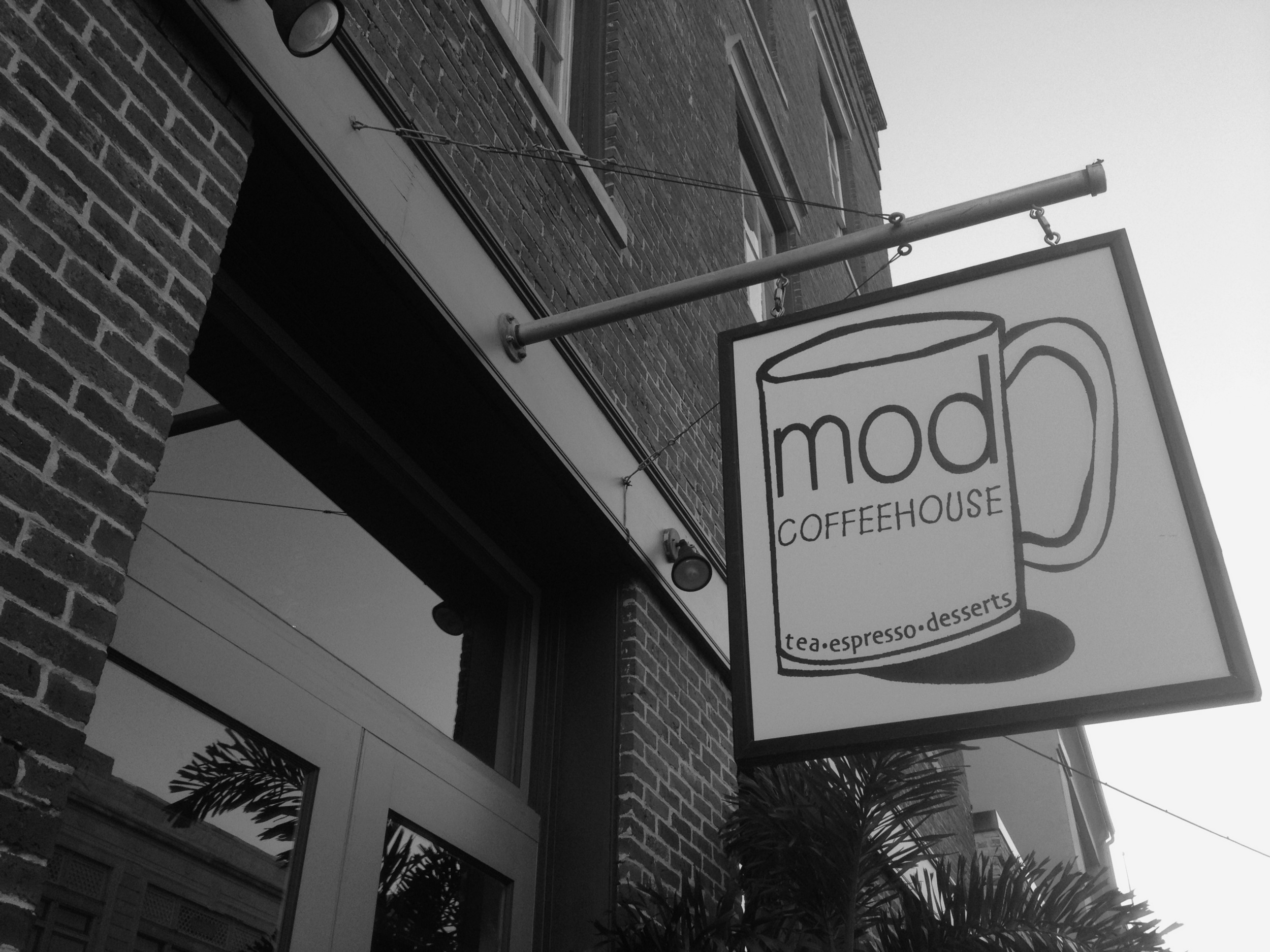
​Absolutely loved this coffee shop. Wish I could've brought it back with me.

​Absolutely loved this coffee shop. Wish I could've brought it back with me.

​
​Purposely-sunken ship. According to our boat tour guide, some guy once lived on this thing by himself for about 10 years without anyone knowing about it, growing his own food and raising chickens and everything. Crazy.

​Purposely-sunken ship. According to our boat tour guide, some guy once lived on this thing by himself for about 10 years without anyone knowing about it, growing his own food and raising chickens and everything. Crazy.

​Rocket boosters from the incredible Saturn V rocket.

​Rocket boosters from the incredible Saturn V rocket.

Black & white photos can show a surprising amount of detail (like lines and shadows) compared to their full-color counterparts.

​
​I can't shake the fact that this looks like the trollface guy from Reddit.

​I can't shake the fact that this looks like the trollface guy from Reddit.

​

Overall, shooting with Hueless seems like an easy way to make your photos "pop" in an interesting way. I wouldn't say it's a fix-all for every​ boring photo, though. Obviously, subject and composition still play a huge role in the shot, and sometimes it's just plain better to shoot in color.

Take this motorcycle, for example. I shot both a full-color version and a monochrome version, and I honestly find the color version more compelling visually:

​
​

[These photos remind me of the inherent limitations of the iPhone 4S' camera, even as capable as it is. For one thing, it's nearly impossible to adjust the depth-of-field the way I'd like.​ Had I been shooting with my DSLR, I certainly would have shot with a larger aperture in order to have a hazier background while keeping the foreground in focus. Not a huge deal, but something to keep in mind if you plan on shooting with just about any smartphone camera, as of this writing, anyway.]

I shot two versions of this ​engine-order telegraph as well, and also found the color version more interesting.

​
Almost looks like an Instagram filter, but this is just how the iPhone shot it.

Almost looks like an Instagram filter, but this is just how the iPhone shot it.

​I have other examples of this phenomenon I could display, but hopefully you get the idea. Don't just expect that a monochrome photo will automatically look better than a full-color version. Shoot in both if you must, but always try to capture the best image you can without trying to force the subject to fit into a certain style of photography.

​Overall, I'm pretty happy I tried this experiment out. I feel like a whole new level of photography has opened up to me, and I fully expect to capture more monochrome shots in the future. I found that I was composing photos differently than I normally would, because certain perspectives are more visually appealing in black & white, and vice versa. It has also reminded me that photography can be fun.

​Even if someone hates the photos I took with Hueless, they can't take away the fact that I had a blast with it.

Welcome to the New Unretrofied

​I have a habit of tweaking this website a lot. I just can't seem to settle on a given "look". Why on Earth did I pick that typeface? Why are those colors not matching? Is my site actually easy to read? These are the questions I'm asking myself all the time.

​Today, I did more than just tweak. I've moved Unretrofied from Squarespace v5 to Squarespace v6. Doesn't really sound like a big deal now that I'm typing those words, but I assure you, the stuff happening behind the scenes is very different. This is a totally new platform. Versions 5 and 6 are entirely incompatible, so it's not as easy as clicking an 'upgrade' button. This site has been completely rebuilt from the ground up. My hope is that I can make the site a bit more minimalist but still a bit unique.

​Here's what the site looked like before:

​

Obviously, the new site has done away with the two-column layout in favor of a nice, wide single-column format. I feel that this change alone makes my posts more pleasant to read. I've also opted for more line spacing and larger typography. The end result is that the site's text actually has a chance to breathe a bit. I was inspired to do this by Benjamin Brooks' current blog design, which is even more minimalist than mine.

​Another obvious change is the lack of red post titles. I originally made it that way so that if someone were scrolling through the page, they could quickly and easily pick out each entry. The problem with that is that it leads to the site feeling more busy than it needs to be. I've found that I don't really need a bunch of glaring text to achieve this effect. Instead, I've simplified the color scheme, added more space between each post, and increased the size of the post titles themselves. Looks much nicer and still allows the reader to easily discern each post while scrolling.

​Also new is the navigation menu bar at the top of the site. This replaces the 2nd column that existed in the previous design, and it's still easily accessible at all times (it stays on-screen while the site simply scrolls "behind" it). This is also where the site kept a little of that red color, in that whatever page you're currently viewing is shown in red on the menu bar. All links on the site also show in red on hover. I guess I just couldn't bring myself to part with it entirely.

​Images within posts are now larger than before, something I've wanted to try for a long time but couldn't because of the constraints of the old design. I love looking at big, beautiful photos on the web. In fact, this change in design may be the encouragement I need to get out my old DSLR so I can capture great images to use on the site.

One thing I'm excited about is that v6 allows for mobile-formatted pages, and now I've got a very nice-looking ​mobile website. I haven't been able to test it from any other phones but my own, but on my iPhone 4S, everything looks very nice (Update: After writing this post, I had a chance to test the site from a few Android devices. Looks great there, too).

​

​On this mobile site, the top navigation bar is hidden under a 'Menu' button. Tapping that button gives you a nice little "sliding down" animation, revealing a drawer containing the hidden navigation links. Tap 'Menu' again, and the drawer slides back closed. Pretty neat.

​

With this change, and with the two-year anniversary of Unretrofied coming up in October (wow, I can't believe it's been that long already), it seems like as good a time as any to start writing some more long-form opinion pieces and product reviews, much like the ones you'd find on Minimally Minimal. Up until now, most of my posts have been links to content elsewhere on the web, but that's not very fulfilling creatively. I would rather blog less often but produce higher-quality content than be a lazy 'curator'-type. Quality always beats quantity when it comes to blogging, and it's about time I started showing it.

​Whatever happens next, I hope you guys enjoy the improved design and I encourage any constructive feedback you'd like to give. Hit me up on Twitter and let me know what you think!

Note: Due to the site change, it was necessary to change the URL to my RSS feed and subscribers will need to update their readers accordingly. Apologies for the inconvenience.

'The Problem with Logos'

Speaking of Andrew Kim, I'm going back through some of his older posts because I find most of them to be very fascinating, as someone with an interest in minimalist design.

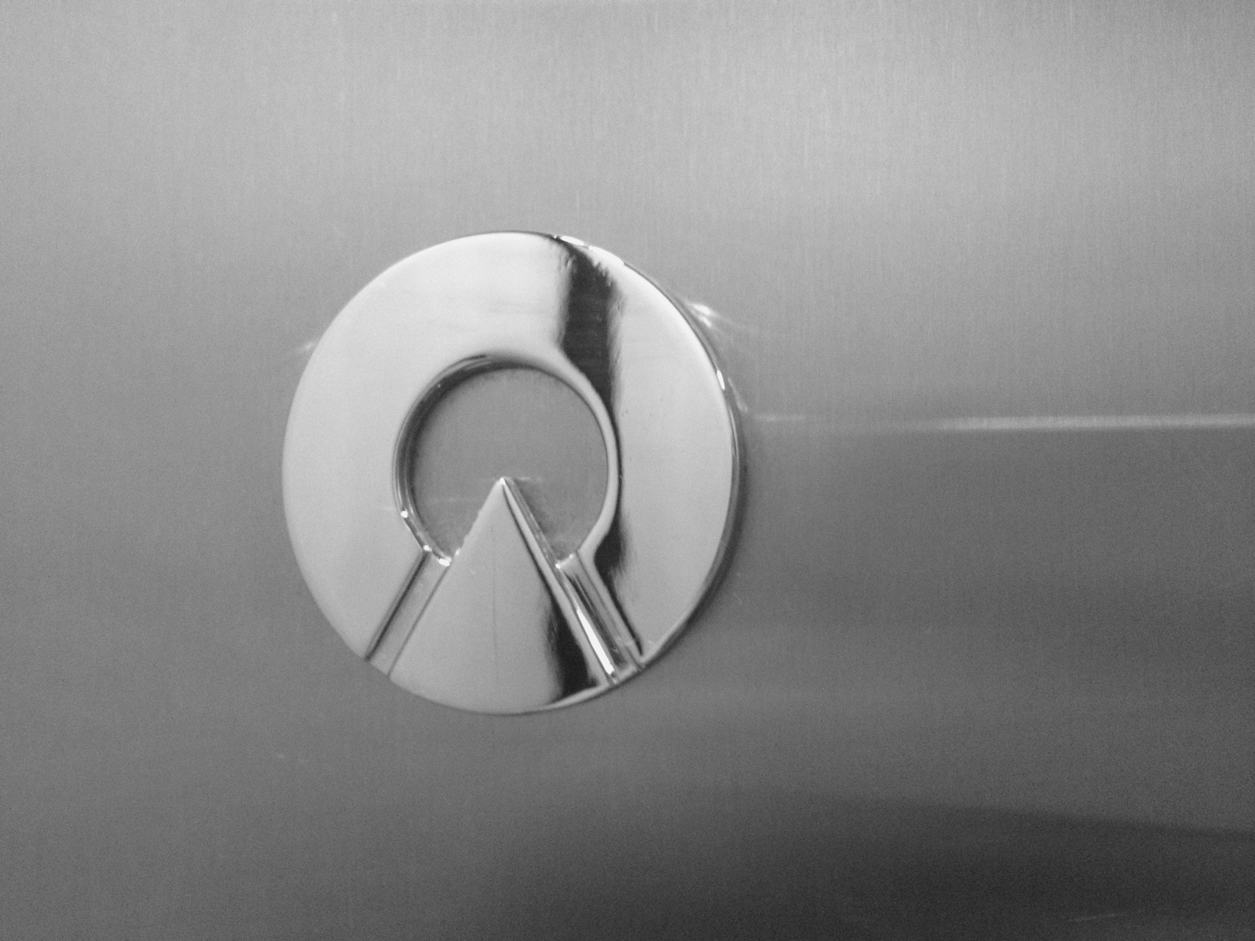
This one speaks to me quite a bit because I feel the exact same way about logos being splattered all over products today. I don't buy things like clothes or smartphones just because they carry a certain brand name or logo in an obvious way. If anything, I find it to be a huge turnoff.

Regarding the Samsung Galaxy Tab (pictured above), Andrew had this to say:

Here is another example. Can you believe this? This is criminal. The Galaxy tab has 2 logos on the front and 3 GIANT logos on the back. People should go out and riot about this device. What is this, an F1 car? Verizon and Samsung should have to pay people to use this.

Couldn't have said it any better myself. If you've already paid for the device but are then forced to be a walking advertisement for the company, they should be sending you a check in the mail. Ridiculous.

Make sure to read the follow-up post, too.

IFTTT is Fantastic, and You Should Use It

1000w.jpg

I'm pretty late to this party, but I am falling in love with task-automation service ifttt (if this then that). Basically this service allows you to create "recipes" of behavior using "channels", which is just a codeword for the list of different services involved, such as Facebook, Evernote, Instagram, Dropbox, Twitter, Youtube, SMS, email, and a LOT more.

The idea is that you can have ifttt check one of these channels for a certain type of activity, and then trigger a second channel in a specific way. For example, I have a recipe that checks for any new photos I post on Instagram, and then saves those photos to a folder of my choosing in my Dropbox account. Another recipe watches my Unretrofied RSS feed and auto-tweets any new entry it sees.

These are two simple uses for the service, and aren't even considered a drop in the bucket of what ifttt is capable of. There are currently 47 channels available, and most (if not all) of them have multiple trigger types, AND there are more being added all the time, so the number of possible combinations is staggering. Luckily, you can already see some of the interesting things people have come up with on their public recipes page.

I recommend at least checking it out and seeing if you can get something useful out of it. There's a little something for everyone.

ifttt

'I Give Up'

Andre Torrez:

But somewhere in between that new iPad, the unserviceable laptop non-story, and that idiotic comment about the new Retina displays something in my brain snapped. I give up. I surrender. The war is over. I can’t care about this stuff anymore. Getting annoyed at the pace of technology is fruitless for me. Being cynical about any new bit of technology that doesn’t fit into my view of how stuff should work has been a dragging anchor in my life.

'Evernote and Dropbox: Why I Use (and Love) Both'

1000w.jpg

Brett Kelly, author of the popular Evernote Essentials guide, writes about how he uses both Evernote and Dropbox for different purposes:

This isn’t to say that, should one be so inclined, somebody couldn’t make Evernote into a kind of a Dropbox or Dropbox into a kind of an Evernote. The similarities are strong enough (barely) such that one could theoretically be used in place of the other. I’m not a fan of this idea because I’m a firm believer in using the right tool for the job.

I have to agree. I am also a user (and fan!) of both services, and happily pay for both of them each month ($5/mo for Evernote Premium, and $10/mo for Dropbox Pro 50GB, although I might even upgrade the Dropbox account to the 100GB soon).

Each service was clearly intended for different use-cases. For example, my Dropbox is essentially a replacement for the 'My Documents' folder on any PC I use. It's where I store my iTunes library, including several movies for streaming on my iPhone via the mobile app, as well as all of my personal photos, installers for many useful applications, various documents (sorted by type), backups of files I may need later, and more.

My Evernote account is mainly used to store 'clipped' content from websites, or notes that take advantage of Evernote's multimedia features. Examples would include recipes, gift ideas, stuff I want to buy later, travel notes from cities that I've visited, important information that I may need for my full-time job (yes, I have a job outside of Unretrofied; you think I actually make money doing this?), copies of receipts, stuff I have liked (photos, wines, foods, art, etc), how-to articles for projects, blog post drafts, various sorts of inspiration (style, fitness, design, writing, etc)....the list goes on and on and on.

I agree that Dropbox could feasibly be used for the same purposes that I use Evernote for, but it would be far more convoluted. I would rather just highlight content on a webpage and click the 'Clip to Evernote' button in my browser than try to recreate a webpage layout in a Word or PDF document. Sometimes you don't even have to do that much! If you just click the Clip button without highlighting anything, it can usually determine what content you're looking to save automatically (automagically?) except in cases of weird website layouts.

The nice part of Evernote is that everything is easily tagged and searchable, including the text within images. Dropbox has no such feature, you can only put certain files in certain folders for your own organizational purposes, which I have done since I'm borderline OCD, but it's just not the same.

Evernote is a glorified bookmarking service, while Dropbox is a place to store files (although I do occasionally attach files to certain notes within Evernote). There's room for both in the world, and I don't see either of them really reducing the value of the other.

NerdGap | Evernote and Dropbox: Why I Use (and Love) Both

The Morality of 'Read Later' Services

I came across a series of tweets by @indefensible today that are accusatory toward 'read later' services such as Instapaper: 

I understand the point he's trying to make, but there's nothing that a service like Instapaper is doing that a user couldn't simply do themselves by copying/pasting an article's text into notepad for reading later. In the case of Instapaper specifically, the user has already "viewed" the design and ads that are inherent to the website they're reading before saving the text for later, so it's not like the site lost something during this process.

There is also an argument to be made for the sheer utility of these services. There are people who enjoy reading but may not have network access at all times (such as in an underground subway car), so having an article saved offline for later reading is a boon for them. The only way they would be able to do this and still see the site's original design (ads and all) would be saving a PDF copy of that site, but c'mon, who's going to do that?

The Readability Argument

Ben Brooks discusses the recent argument about Readability that took place on Twitter over the weekend between the likes of John Gruber, Jason Snell, Jeffrey Zeldman, and others, and also led to this blog post by Anil Dash. After reading Dash's post and following the Twitter conversation, I am still left wondering the same two things as Brooks:

  1. Why does Readability feel it is OK to collect money in another’s name without that persons permission?
  2. What, specifically, happens to the unclaimed money?

I think users and publishers deserve answers to both of those questions.

Eagerly waiting to hear the answer to those, since they have still gone unanswered since this entire argument began months ago.

On iPhone Screen Size

Photo: The Techblock

It's that time of year again. The rumor mill about the next iPhone has started spinning and theories are wildly being flung about by everyone and their grandma's dog about what features we can expect and what the new hardware will be like. The most common assumption of all? Bigger screen size.

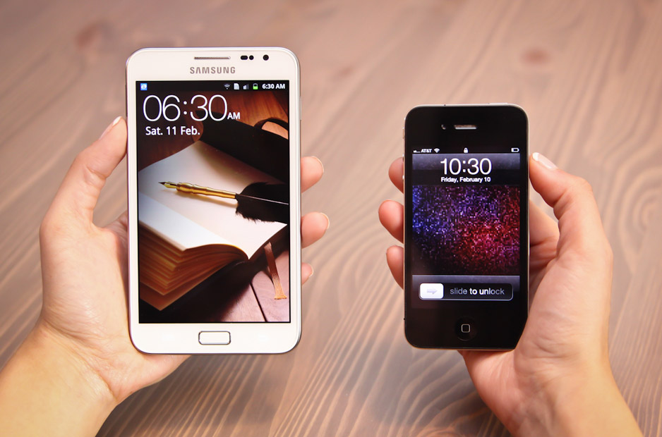
In the last year, we've seen Android and Windows Mobile 7 phones being sold at screen sizes much larger than the iPhone's humble 3.5" display. Some of these entries into the market have been comical at best (see the photo above from The Techblock's satirical review of the Samsung Galaxy Note, which is a 5.3" behemoth) while others have been somewhat more respectable, such as the Samsung Galaxy S II's 4.3" display.

The question is, does screen size really matter? Or more specifically, would a bigger screen truly improve the iPhone that much?

The most prevalent opinion I've heard on the issue is that the "sweet spot" for smartphone screens is somewhere between 4.0" and 4.5". While I don't think these numbers are outlandish by any means, I have to wonder, why the obsession with having a big phone screen?

Some background: I've been an iPhone owner for several years now (since 2008 when the iPhone 3G was released), I currently own a 4S, and I have been extremely happy with each new iteration of the phone. It's compact, it fits my needs perfectly, and any complaints I have are minor and usually reserved for iOS itself instead of the hardware.

To me, a phone should fit these two criteria for size:

  • Easy to get in and out of my pocket
  • All parts of the screen can comfortably be reached by my thumb when I'm holding the phone in one hand

The 4S definitely meets these criteria and a nice side effect is that I don't feel like an idiot holding a near-tablet-sized device to my head when I'm taking a call.

Despite my feelings about the 4S, when I browse the web I see a growing number of derisive comments about the phone, stating that Apple is losing its edge or refusing to keep up with the market. I can't take these statements seriously, given how insanely popular the device is. Obviously there is something that keeps people coming back to the iPhone year after year despite its screen size and not because of it.

If Apple were to increase the display size, they would also need to drastically increase the number of pixels or else it would no longer be considered a Retina display. This would come with all sorts of tradeoffs, the biggest two being battery life and app-developer support. Think of how many apps would have to be redesigned for the new size when so much has already gone into making apps Retina-compatible. Battery life is already only decent at best (it's not uncommon for me to have to charge my phone a little during the day in addition to my nightly full charge) so I can't see Apple making this tradeoff until they figure out a way to make batteries last much longer than they do now.

I think Apple made the right call on screen size a long time ago when the first iPhone released, and I can see no need for it to be changed that would improve my day-to-day use. At 3.5",  even the elderly can comfortably use the iPhone one-handed, while the younger hipster-types out there can easily slide it into their small jean pockets. This is what I would call the "sweet spot" since it attracts consumers from many different demographics, rather than just the tech geeks out there who think that bigger necessarily equals better.

On the SOPA Blackouts

Tens of thousands of websites, including big names such as Wikipedia, Google, Reddit, Wordpress, and Mozilla, have blacked out their pages today in protest of the SOPA/Protect-IP bills that are being pushed through the US Senate despite massive opposition from just about everybody else.

I support the idea behind the blackouts, but I also agree with this piece by Joe Brockmeier over on ReadWriteWeb:

The dirty little secret of SOPA is not that the entertainment industry has far more influence than it ought to have on Congress. Anyone who pays attention already knows this. The dirty little secret of SOPA is that almost nobody pays attention to what Congress is doing 99% of the time.

[...]

Most of the SOPA/PIPA tools have to direct people to their representatives because they don't know who they are or how to contact them. Think about that for a moment. It's good policy for a political organization to make it as easy as possible for voters to act, of course. But, without instruction, a large swath of the voting public has no idea who to contact or how. Worse, unless you make it as easy as humanly possible, they won't bother.

I'm glad that the big guys are raising awareness about this issue, but I have to wonder, will this really spur public activism on a widespread scale? Most people I've talked to have no idea what any of this SOPA stuff means or why it will matter to them. These are the people who don't follow technology matters all the time and will simply be annoyed that their favorite website has been shut down, even if for only one day.

It also seems a bit odd to me that people are protesting so hardly about something that would be pretty easily circumvented even if the bill passes. But what about healthcare? Remember when everybody got outraged about our healthcare system and cried out for reform a few years ago during Obama's election?

Now you hardly ever see it come up in public discussion, at least not on the same scale. The general public has a very short political memory and I can only assume that the same thing will happen with SOPA/PIPA. It will be all over Twitter, Facebook and plenty of blogs for a little while, and then people will move on to the next bandwagon cause. And so it goes.

Say Hi to the Newest Member of the Gonzales Family

Yesterday at 4:10am, December 21 2011, our son Brendon Elliot Gonzales was born into the world. At 7 pounds, 12 ounces, and 21 inches tall, he's the perfect (early) Christmas present.

402614_10100496331494597_1037937754_n.jpg

Although he's had a little trouble breathing and is being kept in the NICU for a week while he gets better, we couldn't be happier. I'm excited to be a father and will be spending copious amounts of time holding him in the upcoming weeks.

As I write this, he's finally getting some sleep now that the flurry of visiting friends and family has slightly subsided (emphasis on slightly haha). My wife is also getting some much-deserved rest, and even I am going to try and get a little sleep in. It's been a crazy 60 hours.

'See Ya Dad'

Marvel artist Skottie Young's father passed away last week and he wrote a lovely piece about it:

He was a good man, and as a Thor lover from childhood he was very proud that I hang my hat at Marvel drawing comics. There wasn't a person he came in contact with he didn't mention it to. When I bought my car, he mentioned it to the dealer as if Spider-Man would inspire them to cut a couple thousand off the price. Ha ha. He was proud of me. He was a husband and father of four who worked at CAT for 34 years so I don't have say that I am proud of him, but... I am very proud of him.

'Facebook Nation'

Nancy Baym, writing for Social Media Collective, on the idea of a universal Facebook login being regarded as a "passport" for the internet:

But we should think long and hard about its implications. Except for nations that block the internet or some of its sites (hello, China!), the internet has thrived on being a set of domains across which we could travel without passports. Do we really want Facebook citizenship to become a requirement for accessing other domains? Do we really want an internet where we not only need a passport, but a passport from a nation – any nation – owned by a privately-held corporation? Either social network “citizens” need rights beyond emigration or we need to push back hard. We must be the builders of our own futures, not subjects in a nation motivated by profit.

It's a good read, go check it out.