Review: Apple's Earpods

2012-10-16_091803.jpg

​I haven't had a lot of luck with iPhone earbuds over the years. The inline microphone and buttons tend to break, which sometimes causes the right earbud to stop playing sound anymore. My right ear is apparently oddly shaped anyway because it's hard to keep that earbud from constantly falling out (which my left ear never has a problem with).

As for my most recent set, I left them at a hotel on accident. For the last couple months I've been entirely without any earbuds, instead relying on a set of mediocre Skullcandy headphones I inherited a while back. Once the iPhone 5 was announced, along with the alien-like Earpods, I figured it was about time to pick up a new pair again.

[Just to be clear: I'm not getting an iPhone 5, so I've purchased the Earpods separately. The 5 is nice but I'm not so impressed that I'm ready to ditch my 4S yet.]

I was especially encouraged by all the great reviews I had seen from people who found that the new earbuds stayed in their ears better. After picking up a pair the other day, I have to say, that's still not the case for me. Even with the new design, I have to angle the right earbud a certain way for it to stay in my ear, and even then it still falls out every once in a while. No fault of Apple's really, just something I have to deal with. I know I should probably just get some in-ear headphones to alleviate this, but I've never found a pair that wasn't uncomfortable after a few minutes of use.

Sound-wise, these things are a slight improvement over the old earbuds, but I wouldn't say they live up to the claims made by Apple during the iPhone 5 announcement keynote. The bass is a bit nicer but that's all I've noticed. I'm not an audiophile though, and they're perfectly serviceable for my needs.

I guess I would say my favorite part is, oddly enough, the new "clickyness" of the inline buttons. They actually feel like three very distinct and responsive buttons, rather than one big muddy-feeling button. The sound quality of the mic itself seems about the same as before but I haven't tried it in extremely windy weather yet. Since the mic is totally encased in plastic instead of having a little exposed hole, I imagine it will work pretty well.

​Overall, these are a decent set of earbuds but I think $30 is a tad bit much to pay for them. You can find earbuds of similar or better quality for much less. I just hope this pair doesn't break on me.

A "Review" of Felix for App.net

2012-09-25_172359.jpg

I'm not an App.net (ADN) user. I've definitely considered becoming one, considering Twitter's behavior lately, but I'm still having trouble justifying the $50.​

​With that said, I've been hearing a lot about a new iOS client for ADN called Felix that just released today, and I thought this would be a good excuse to analyze some of the app's design from the perspective of someone who has no idea what using ADN is like.

Let's take it screenshot-by-screenshot.​

mzl.okthxjbj.320x480-75.jpg

This is what I assume is the main screen in Felix, basically equivalent to a Twitter timeline. Initial reactions:

  • The font choices are okay I guess, nothing special. Not sure I care for the cream-colored background. The actual ADN website has a textured gray background and white posts. If I were making a mobile client of that site, I'd probably stick with their color choices to make it seem more integrated.
  • Something about having drop shadows under every avatar irks me a little.
  • ​I can guess that the first two icons on the toolbar at the bottom are equivalent to 'Timeline' and 'Mentions' but I have no idea what the other three are for. The middle icon is highlighted blue in every screenshot, no matter what part of the app you're in, so perhaps it's a 'Compose' button. The globe icon might be a mobilized form of the public global feed, which is fine I guess but they could've used a better icon. The last icon looks like a speedometer which makes no sense to me.
  • Each post has several actions that can be performed. The arrow button is probably a 'reply to this post'​ feature, but what is the speech bubble for? Maybe that's really the reply button and the arrow button is used for sharing a given post? The recycle icon is likely a 'retweet' equivalent, and the star icon is obviously an 'add to favorites' function.
  • Seems weird and cluttered, having all of those icons inside every single post. Would be better to go the Tweetie route by swiping a post left or right and seeing the actions behind it, or the Tweetbot method of tapping a post and having a tray of options slide out below it.
mzl.hvorhhul.320x480-75.jpg

I guess this is where the speedometer icon takes you. It's obviously a details screen for a specific post in this screenshot, but what happens if you're looking at your timeline and tap that icon? What does it do then? On its own this is a confusing icon choice.​

mzl.brwckfyt.320x480-75.jpg

The 'compose' screen. The auto-complete hashtag bar in the middle is reminiscent of Tweetbot to me. The top toolbar is a bit weird.

  • The 'x' button is probably meant to cancel the post, but I can't tell what the drawer icon next to it is for.  Perhaps an upload button of some kind, but what would anybody be uploading aside from photos, which the camera button is clearly for?
  • The paper airplane is probably the 'publish' button but it's an odd choice over just having a button that says 'Post' or something. Maybe I'm weird, but it just looks like a "Send to Sparrow.app" button to me.
  • The character count should probably be moved down to the middle bar (on the right-hand side of course, so as not to interfere with the hashtag auto-complete).
mzl.mpdipvgq.320x480-75.jpg

Don't have much to say about this one. The star button at the top right is interesting, can you favorite entire conversations on ADN? The colors of the posts (the blue being your own posts and the green being people you follow?) are similar enough that they're hard to differentiate​, to my eyes.

mzl.ftwfohhl.320x480-75.jpg

Ohhhhhh, I get it. The speedometer icon means 'dashboard'. Clever. I notice that there's an option to see your starred conversations, so I guess I was correct about that last screenshot. I would say that on this screen, it's okay to have a drop shadow under your avatar since it's meant to stand out. Still doesn't make sense on the timeline, though.​

Overall, this seems like a nice app, but there are some weird UI conventions going on. Obviously, this is v1.0 so it should only improve from here, and maybe if the developer reads this post they can understand what a new user might think when they first look at the app.

Either way, it's a fun thought exercise. I recommend that other app developers do this for apps they know nothing about too, so they can put themselves in the shoes of their own first-time users.

If you're on App.net and would like to try Felix out for yourself, it's $5 on the App Store and works with both iPhone and iPad.​

Review: 'Drafts' for iOS

mza_865247112103094350.png

Ever have an idea that suddenly popped into your head that was so good you needed to jot it down, but by the time you get a chance to write, you've forgotten what it was? Or do you have an idea that isn't yet ready for the big time and needs to be refined first? You need an app like Drafts.

​Drafts is designed to help you get your ideas out of your head into text form in the quickest way possible. When you open the app, it promptly greets you with a blank white canvas and a keyboard. No searching for previous notes, no need to add a title first, no distractions. Once you open the app, you simply start typing.

2012-09-25_085131.jpg

After you've finished typing, you can tap the '+' icon on the center toolbar and save it for later, or you can tap the 'Share' icon on the right side and export it to many different places, including Evernote, Tweetbot, SMS, Facebook, Reminders, Dropbox, ​Omnifocus, Sparrow, Agenda Calendar, and a lot more.

Drafts supports ​Markdown as well, if you're into that sort of thing. I've personally been using it as a tool for practicing Markdown on the go, since it includes options to preview the HTML output of your Markdown or send it elsewhere for use.

​If you would like to go back and see all of your previous drafts, just tap the 'paper' icon on the tool bar and the keyboard will slide down, revealing the drafts list underneath. There's no organizational structure that I'm aware of (like folders or tags), but if you need to find any specific thing you can just use the search feature (obviously, it's the magnifying glass icon on the toolbar).

​Drafts has become extremely useful for me, because I often have an idea spring to mind that I forget by the time I can get it into text form. I could just open Evernote and create a new note there, but Drafts feels so much more direct and I don't feel like I'm going to forget anything by the time it opens because it only takes a second or two.

With Evernote, I have to wait for the notes list to finish syncing, then tap the 'New Note' button, then tap in the body area to start typing. Those extra seconds really do matter, especially when you're doing those same things every single time you open the app. Plus, with Evernote, I'm tempted to properly tag and title each note when I'm done, but with Drafts I don't feel that compulsion. In this case, simple really is better.

There are plenty of other features in Drafts that I haven't even talked about here. For such a simple app, it's pretty powerful, and I highly recommend it. The iPhone version is $2 and the iPad version is $3.

iOS Annoyances

I jumped the gun a little early and un-jailbroke my phone. I've been running stock iOS 5.1.1 for about 8 days now. I didn't have any special reason to do this early, other than that I'd like to try out the OTA update process whenever iOS 6 drops.​

​Since then, I've noticed a definite speed increase in regards to typical usage. Apps seem to load faster, the lockscreen rarely hangs, and keyboard taps feel more responsive. I've even noticed a marked increase in battery life, which is great.

But it's not all a bed of roses. I'm remembering exactly why I jailbroke in the first place, and I put together a list of things about iOS that irritate me or could use some added functionality. I would hope that someone at Apple reads this and passes it along, but I'm just some guy without a lot of clout so there's no reason to expect such a thing. Anyway, here we go:

Notification Center

  • ​On the lockscreen, you can't mark items as 'Read' or even delete the alerts. All you can do is swipe right on a particular alert and it will unlock the phone and take you to that app.
  • You can delete the alerts from the pull-down Notification Center menu once you're logged into the phone, but even that can't be done on an individual basis; you have to tap the 'X' icon for an entire group of notifications (i.e. all SMS messages, or all emails, or all Facebook notifications, etc) and then tap the 'Clear' button that appears in order to make the notifications disappear. And doing so still doesn't mark the items as read within those apps, so you still have to open them afterward.
  • Let's say I've already read a series of emails on my desktop machine. These emails are now marked as 'Read' on the desktop AND within the iPhone email client as they should be, and yet when I sign into my phone​, I still get a bunch of different alerts at the top of the screen about stuff I've already read. Pointless.
  • There should be easier access to certain toggles at all times, for things like wifi, airplane mode, volume, brightness, bluetooth, etc.​
  • ​The top-screen notifications are simply too big, and they interfere with usability. If I need to tap something at the top of an app screen, I either have to wait for the notification to go away, or I can pull down the Notification Center menu a little bit and then flick it back up to dismiss the notification.

The fixes: LockInfo, NCSettings, and ​SmallBanners.

Email/SMS/Contacts

  • There is still no 'Quick Reply' or 'Quick Compose' functionality within iOS for things like SMS or email.
  • I'd like to have photos next to entries in the Contacts list.​

The fixes: biteSMSand Cyntact.

​Homescreen

  • ​There's still no way to get rid of the Newsstand icon or hide it within a folder, since it is treated like a folder itself.
  • Perhaps they could allow us to have folders within folders. That would fix the issue above, and also allow gamers that have a ton of games to keep a single folder of Games with various folders inside for the different genres (RPG, Card, Racing, etc).
  • Folders are simply too limiting by only allowing 12 apps at a time. ​I want functionality where folders are like mini-homescreens, each with the ability to contain multiple pages of apps.
  • I wish I could have 5 icons on the dock. With only 4, there's not a lot to visually differentiate the dock from the rest of the homescreen. Also, I would bet that people are more likely to have 5 apps they use all the time and not just 4 (at least, that's true in my case). The OCD part of me also likes having one of the icons on the dock centered, which acts as my most-used icon. It's kinda like how some apps have a center button on their bottom toolbar where the main functionality exists (i.e. the 'Take Photo' button in Instagram, the 'Create Note' button in Evernote, etc).
  • The​ multitask tray is pretty limited, and really only useful for switching between the last 2 (maybe 3) apps, or accessing media controls sometimes. A better option might be something like Multifl0w, which treats apps kind of like Safari tabs that you can browse between, maybe even with the added effect of having live previews of whatever the backgrounded apps are doing. Even if the multitask tray stayed the same as it is right now, it would also be nice if I could swipe up from the bottom of the screen to access it instead of double-clicking the home button. I feel like my home button will be worn down much quicker because of this thing.
  • The multitask tray also cannot be used in landscape. If you're looking at something in landscape and open the tray, it forces you to switch to portrait.​
  • I'd like to be able to move multiple icons on the homescreen at the same time.​

The fixes: NoNewsIsGoodNews, Folder Enhancer, Five Icon Dock, Multifl0w, Zephyr, Switcherland, and MultiIconMover.

​Other

  • ​I wish I could have different sound profiles for everything. For example, it would be nice to have my ringtone and my SMS tone at different volume levels, because some of my ringtones are quieter than others and I need to turn them up to a level that can sometimes make my SMS tone unbearably loud. Also, different apps should have different volumes from one another. When I switch from Instacast (where I usually have to turn the volume up to hear people speak), to Spotify, the music can be crazy loud at first.
  • Game Center is still an abomination of design. It's not the skeuomorphism; the thing is just garish​ in general. It should look more like Xbox Live's interface or something.

I'm not aware of fixes for either of these things yet.

​Overall, I'm still happy to be using iOS, and there are still some cool things built-in, but without these particular additions it just feels like a good OS and not a great one.

An Experiment in Monochrome iPhoneography

 
​

​Lately, I've been feeling a little inspired to get back into photography. I know I mentioned in my last post that I might dust off the ol' DSLR (a Canon EOS 20D, if you care to know) and shoot with that, but right after writing that post, the family and I took a vacation and I hate carrying a camera bag around all day long. Instead, I decided that I was going to shoot exclusively with my iPhone 4S, and to make it more interesting, I was going to do a little experimenting with monochrome.

This is an experiment I've been wanting to do for a while now, especially after reading about the Leica M Monochrom camera, which ONLY shoots in monochrome. I have to admit, the Monochrom takes some incredible photos, but there is no way I'm putting down $8,000 even for a camera like that.​

Luckily, an app exists for iOS called Hueless, and it performs the same basic function as the Monochrom: it forces you to shoot in black & white. This isn't like applying a filter over a color photo, though. Photos shot in Hueless are truly black & white, with deeper blacks, crisper lines, and a relative lack of photo "noise" compared to, say, Instagram's black & white filter. And the app is only a couple bucks, so the price of entry is obviously much lower than buying the Monochrom.

Now that I'm back from that trip, I'd like to share some of the photos I captured, as well as a few things I noticed along the way (which will seem obvious to your average professional photographer, but I'm kind of self-teaching here so please excuse my amateur-isms).​

One of the things I first noticed i​s that this app is perfect for capturing sunrise/sunset silhouettes.

​1877 Elissa, a fantastic little cargo ship that has been (and is still being) kept up by volunteer workers.

​1877 Elissa, a fantastic little cargo ship that has been (and is still being) kept up by volunteer workers.

​It also performs surprisingly well in low-light situations. In most cases it's a much better alternative to using the iPhone's terrible built-in flash, which tends to make photos garish and unflattering.

​This one reminds me of Peter Pan, for some reason.

​This one reminds me of Peter Pan, for some reason.

​This was taken at night with only a nearby streetlamp providing light on top of what the moon was giving us. I was impressed with how well this turned out, even with the photo noise.

​This was taken at night with only a nearby streetlamp providing light on top of what the moon was giving us. I was impressed with how well this turned out, even with the photo noise.

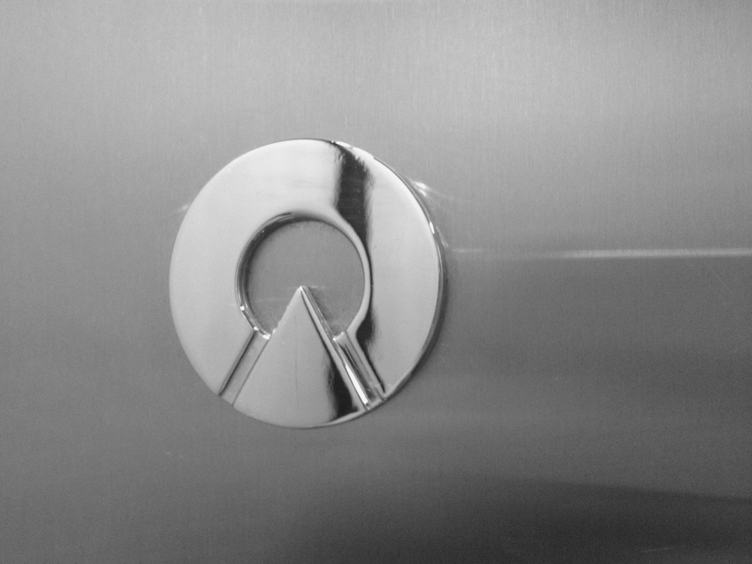
Of course, when you've got some real light to work with, you can capture even better images. Reflective objects photograph especially well in monochrome.​

​
​
​
​I really wish I could have captured this statue without the person swimming in the background. You can't unsee it now, can you?

​I really wish I could have captured this statue without the person swimming in the background. You can't unsee it now, can you?

I absolutely love the way architecture (or any other large structure)​ looks in monochrome.

​Had to walk into the middle of a 4-way intersection to get this one. I don't necessarily advise this, but sometimes it's worth it to get the shot.

​Had to walk into the middle of a 4-way intersection to get this one. I don't necessarily advise this, but sometimes it's worth it to get the shot.

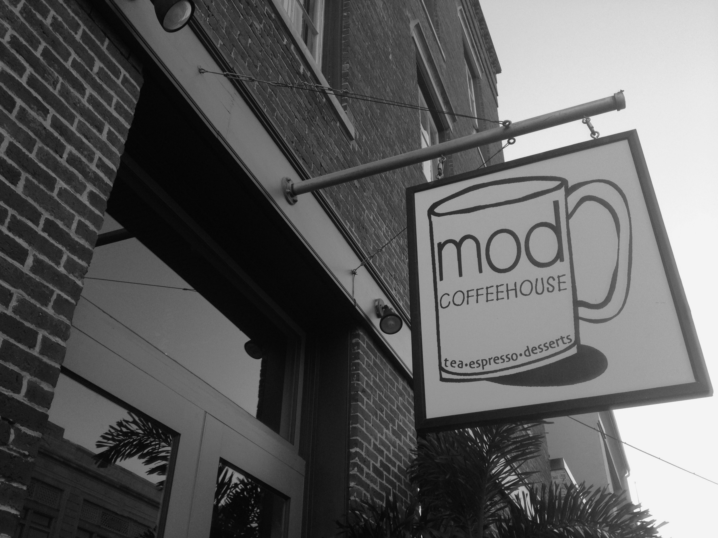
​Absolutely loved this coffee shop. Wish I could've brought it back with me.

​Absolutely loved this coffee shop. Wish I could've brought it back with me.

​
​Purposely-sunken ship. According to our boat tour guide, some guy once lived on this thing by himself for about 10 years without anyone knowing about it, growing his own food and raising chickens and everything. Crazy.

​Purposely-sunken ship. According to our boat tour guide, some guy once lived on this thing by himself for about 10 years without anyone knowing about it, growing his own food and raising chickens and everything. Crazy.

​Rocket boosters from the incredible Saturn V rocket.

​Rocket boosters from the incredible Saturn V rocket.

Black & white photos can show a surprising amount of detail (like lines and shadows) compared to their full-color counterparts.

​
​I can't shake the fact that this looks like the trollface guy from Reddit.

​I can't shake the fact that this looks like the trollface guy from Reddit.

​

Overall, shooting with Hueless seems like an easy way to make your photos "pop" in an interesting way. I wouldn't say it's a fix-all for every​ boring photo, though. Obviously, subject and composition still play a huge role in the shot, and sometimes it's just plain better to shoot in color.

Take this motorcycle, for example. I shot both a full-color version and a monochrome version, and I honestly find the color version more compelling visually:

​
​

[These photos remind me of the inherent limitations of the iPhone 4S' camera, even as capable as it is. For one thing, it's nearly impossible to adjust the depth-of-field the way I'd like.​ Had I been shooting with my DSLR, I certainly would have shot with a larger aperture in order to have a hazier background while keeping the foreground in focus. Not a huge deal, but something to keep in mind if you plan on shooting with just about any smartphone camera, as of this writing, anyway.]

I shot two versions of this ​engine-order telegraph as well, and also found the color version more interesting.

​
Almost looks like an Instagram filter, but this is just how the iPhone shot it.

Almost looks like an Instagram filter, but this is just how the iPhone shot it.

​I have other examples of this phenomenon I could display, but hopefully you get the idea. Don't just expect that a monochrome photo will automatically look better than a full-color version. Shoot in both if you must, but always try to capture the best image you can without trying to force the subject to fit into a certain style of photography.

​Overall, I'm pretty happy I tried this experiment out. I feel like a whole new level of photography has opened up to me, and I fully expect to capture more monochrome shots in the future. I found that I was composing photos differently than I normally would, because certain perspectives are more visually appealing in black & white, and vice versa. It has also reminded me that photography can be fun.

​Even if someone hates the photos I took with Hueless, they can't take away the fact that I had a blast with it.

IFTTT is Fantastic, and You Should Use It

1000w.jpg

I'm pretty late to this party, but I am falling in love with task-automation service ifttt (if this then that). Basically this service allows you to create "recipes" of behavior using "channels", which is just a codeword for the list of different services involved, such as Facebook, Evernote, Instagram, Dropbox, Twitter, Youtube, SMS, email, and a LOT more.

The idea is that you can have ifttt check one of these channels for a certain type of activity, and then trigger a second channel in a specific way. For example, I have a recipe that checks for any new photos I post on Instagram, and then saves those photos to a folder of my choosing in my Dropbox account. Another recipe watches my Unretrofied RSS feed and auto-tweets any new entry it sees.

These are two simple uses for the service, and aren't even considered a drop in the bucket of what ifttt is capable of. There are currently 47 channels available, and most (if not all) of them have multiple trigger types, AND there are more being added all the time, so the number of possible combinations is staggering. Luckily, you can already see some of the interesting things people have come up with on their public recipes page.

I recommend at least checking it out and seeing if you can get something useful out of it. There's a little something for everyone.

ifttt

GoGoStand

Recently I bought a GoGoStand for my iPhone 3G (I know, it's an old phone, but I don't have the money to upgrade very often). It's a little stand that folds up into the size and shape of a credit card, meaning you can easily keep it in your wallet.

This thing has been so useful for me. When I take lunch breaks at work, I can set this thing down on a table and watch videos while I eat. When I'm on a plane, I can set it on the tray in front of me.

It has 3 different viewing angles you can choose from, which is even nicer because you can use it on all kinds of viewing surfaces at different heights respective to where you're sitting. The website says you can put your phone (which, by the way, doesn't have to be an iPhone) in landscape or portrait orientation, but I've found that portrait is hard to balance and sometimes tips the whole thing over. The bottom of the stand isn't weighted, so it's best just to use landscape mode whenever possible, which you're likely to do anyway if you're using this thing to watch videos like I am.

I recommend picking one up, they're only like $5 and are perfect in a pinch.