Apple's October 2013 Keynote

Apple just wrapped up an event that was loaded with new product announcements. I won't bother going into insane detail since the big-name blogs will have it covered, but here's a quick rundown on what was talked about.

Software

The biggest news here is that OS X Mavericks, the iWork suite, and the iLife suite have all been made free (the caveat being that iWork and iLife are only free for newly-purchased devices from this point on) and they're all available for download today. Mavericks will also work on devices dating all the way back to 2007, which I think is pretty cool.

The iWork and iLife apps have been totally redesigned across the board, with new features throughout.

iWork:

  • Full file compatibility across all Mac and iOS devices.
  • Pages has way better text-formatting tools than before.
  • Numbers has interactive charts. For example, you can see your expenses animated over some amount of time.
  • Keynote seems to be the biggest update, with new effects, animations, and transitions, with old transitions being updated with better physics. There's also real-time iCloud collaboration for your presentations now.

iLife:

  • iPhoto now lets you create and order photobooks on the iPad, a feature that previously was only available for the Mac.
  • iMovie now includes a feature called "iMovie Theater", which is a nice-looking collection of all your videos and clips in one place. Reminds me of a media center-type interface.
  • GarageBand on iOS now supports up to 16 tracks (up from 8) and lets you add customizable "drummer tracks" that are recordings of actual session drummers that can automatically play over the song you've created. Projects now sync over iCloud as well.

Hardware

Hardware was really the juiciest part of today's keynote. Along with the iPhone 5s/5c, Apple has now refreshed nearly their entire hardware lineup ahead of the Christmas season (excluding iMacs and cinema displays, basically).

The Retina MacBook Pros have been updated to be more powerful, and yet cheaper to purchase. The 13" model is now $1299 (down from $1499) and the 15" model is $1999 (down from $2199).

The new Mac Pro that will be available in December and starts at $2999, making it the most expensive ashtray I've ever seen. All kidding aside though, it does have some neat features:

  • Fastest processor and memory of any Mac ever
  • Dual-workstation GPUs (a first for Macs)
  • All storage is flash-based — no more spinning HDDs
  • Thunderbolt 2 ports
  • 4K video support, and for multiple displays
  • 70% less energy consumption than the previous Mac Pro
  • It's somehow as quiet as a Mac mini

Now, the new iPads were the most exciting announcement for me personally. Rather than calling the new full-size model 'iPad 5', they went with 'iPad Air', and they're releasing an iPad mini with Retina display!

A quick rundown:

iPad Air:

  • Thinner, lighter, and more powerful.
  • Bezel is 43% smaller.
  • 7.5mm thick, which is 20% thinner than the iPad 4.
  • Only weights 1lb, down from 1.4lb.
  • Reduced battery size, yet same battery life as before (10 hours).
  • A7 chip and M7 coprocessor (same as iPhone 5s).
  • Support for even more LTE bands, meaning better connectivity.
  • Available in two colors: silver/white and space gray/black.
  • Available at $499 (non-LTE) and $629 (LTE), and starts shipping Nov 1.
  • iPad 2 still available as a lower-cost full-size model at $399.

iPad mini:

  • Retina display!
  • A7 chip, but no mention of M7 that I can recall. (UPDATE: I've been informed by my buddy Nate that it does indeed have an M7 chip.)
  • 10-hour battery life.
  • Thinner than a pencil (as shown in a great video that I imagine will be available online soon)
  • Priced at $399 (no LTE) and $529 (with LTE).
  • New Smart Covers ($39) and new leather cases ($79). Both are available in Product (RED) in addition to the standard colors.
  • The non-Retina iPad mini is still available, and has been lowered from $329 to $299.

Overall, this was a huge announcement by Apple. This holiday season is sure to be exciting for a lot of people.

Review: Pocket Casts 4 for iOS 7

Review: Pocket Casts 4 for iOS 7

If someone had told me a month ago that Pocket Casts was about to usurp Instacast's spot on my iOS dock, I would have looked at them like they were crazy.

For as long as I could remember, Instacast was the podcast app that I felt provided the best overall experience on the App Store, and the one I recommended to everyone else who asked. But as it turns out, Instacast's recent 4.0 update sadly resulted in a step backwards in usability. I talked about this a bit in my recent article about the state of podcast apps on iOS 7:

“The playback controls cover up some of the podcast artwork, the advanced toolbar […] can no longer be hidden, and the cloud sync service no longer seems to work properly.”

Replacing an app on my dock is a pretty rare occurrence since I'm picky about what gets put there in the first place, but Instacast just hasn't been cutting it for me anymore. And so, I found myself doing something I never expected: I decided to give Pocket Casts another shot.

iOS 7 and the State of Podcast Apps

 There was a period of time – between early 2011 and about two weeks ago – when I would tell anyone within hearing distance that Instacast was easily the best podcast app for iOS. No doubt about it.

Oh, I'd tried all the big names at some time or another, of course — Pocket Casts,DowncastStitcher Radio, and even Apple's own Podcasts. Though each was great in its own way, something kept me coming back to Instacast time and time again.

It was super easy to use, my subscriptions were synced between my iPhone and iPad with almost no issues1, and of course, it was easy on the eyes. In my mind, the other competitors had lost this battle a long time ago. I was an Instacast guy through-and-through.

And then iOS 7 happened.

Review: Simplenote for iOS 7

Review: Simplenote for iOS 7

 Ever since sometime in 2008, I've been a user and ardent fan of Evernote. Over the years, it's been the place where I've dumped just about everything I possibly can — interesting articles from the web, recipes, tutorials, project ideas, blog drafts, purchase receipts, shopping lists, inventories, gift ideas, bits of inspiration…the list goes on and on.

It was my Everything Bucket — my external brain. And for a while, it was a pretty good one.

'Overcast: Coming Soon'

Marco Arment on his upcoming podcast app, Overcast

“Rather than try poorly, I’ve decided to dramatically simplify.

[...]

If you need tons of features or anything I’m choosing not to do, you’ll probably be happier with one of the others.”

My favorite thing about Marco is that he’ll “sacrifice” features to make a better app. Personally, I hope he leaves out all the extra cruft I never use, such as various playback speeds and a sleep timer.

I'm super excited for Overcast, although he says it'll likely be three or four months before it's released. It's going to be a long few months.

Reeder 2 is Now Available for iPhone and iPad

The wait is ~*finally*~ over. You can now pick up Reeder 2 from the iOS App Store for only $5, and it works on both iPhone and iPad. The previous iPhone version of Reeder already supported Feed Wrangler – my RSS service of choice – but this update also brings Feed Wrangler support to the iPad.

I've sorely missed being able to use Reeder on my iPad, and it feels good to have it back. My initial impression (after only 10 minutes of playing with it) is very positive, other than that it took a long time to sync my Feed Wrangler Smart Streams.

And as always, Federico Viticci published his review of Reeder 2 immediately after the app was available for purchase. Go check it out.

Editorial for iPad is Out

I've been anxiously awaiting the release of Editorial after Federico Viticci mentioned it a while back, and now it's finally here. Speaking of Viticci, you should go read his epic review of the thing.

If you'd like a more summarized description of Editorial, go check out my post about the app on Tools & Toys.

Drafts Has a New Icon

new-drafts-icon.png

Greg Pierce, developer of the much-beloved Drafts:

“I was approached by a large multi-national corporation regarding concerns about the old Drafts “D” icon’s similarities to one of their trade marks. This was likely a somewhat tenuous claim, but I was not interested in pursuing a battle on the matter – and I must say the corporation in question conducted itself in a professional and reasonable matter, which made it much easier to capitulate. At any rate, in the end, I think I like this new icon better.”

The new icon is rather lovely, and I really can't blame Greg for trying to avoid such a legal battle. Still, it's a shame that indie creators have to face such challenges. I highly doubt an iOS app catered to nerds was really going to affect a mult-national corporation's bottom line or confuse their customers in any way.

'Some Great iOS Apps, Currently Free'

Over at Tools & Toys, Shawn Blanc and I put together a list of some awesome iOS apps and games that have gone free this week to celebrate the App Store's 5th anniversary.

Seriously, this list is full of great stuff, so go check it out.

Some Options for Backing Up Your Google Reader Subscriptions

Well folks, this is it — the last weekend before Google reader shuts down for good. By now, you've probably already chosen a new RSS setup to get you through this tragic time, but you should still go ahead and back up your Google Reader data while you've still got a chance.

Luckily, there are several ways to do that:

'Making the NetNewsWire 4 App Icon'

nnw-4-icon.jpg

John Marstall, designer for Black Pixel, details the steps that went into the design of NetNewsWire 4's new app icon, the beta of which I linked to on Tools & Toys the other day:

“With the release of NetNewsWire 4 Public Beta, we wanted to overhaul and modernize NetNewsWire’s app icon as much as the rest of the app. We didn’t throw out everything — the color scheme and satellite metaphor stayed — but the design is completely new.”

I love how much thought and care went into the design (and it certainly doesn't hurt that they're sticking with the astronomy theme).

'Inside Digg's Race to Build the New Google Reader'

Mat Honan went behind the scenes at Digg to get the story on their new RSS reader, which is said to be releasing next week:

“McLaughlin is talking about the future of Digg Reader, the project he and his small team of fifteen have been working on for the past month. Right now it’s just a mess of code, Keynote sides, and shit on a whiteboard. They need to turn it into a real product, one to take the place of Google Reader, which shuts down on July 1. They have less than 60 days. Simultaneously, the same team of five engineers is working to integrate another product–Instapaper–that they’ve just purchased. None of this is top secret, the opposite in fact. Digg publicly promised the world to have a replacement ready in time. They had to move fast. And when you move fast, things get fucked up.”

A few months ago, I never would have imagined that any product with 'Digg' in the title could possibly be interesting, but now I'm actually looking forward to checking Digg Reader out. It certainly sounds like they've put an impressive amount of effort into the project.

'Choose Wisely'

Neven Mrgan looks at the photo-upload dialogs found within many iOS apps, and calls for a little uniformity between them:

“Does it matter if apps are consistent on matters of this sort? Decades of UI theory seems to indicate so. Having the same button say the same thing in all situations means the user has to do less parsing of the text, and can simply rely on quick-glance recognition.”

Like Neven, I've been bothered by these kinds of dialogs for a long time.

The problem is that so many apps use different wordings for these options, and in different orders from one another, that I can't always parse them immediately the way I should be able to. If I don't double-check the list, it sometimes ends with me accidentally tapping the wrong option.

Obviously the problem is avoided if I take an extra second or two to verify which option I'm selecting, but when you're having to do this all the time between all the various apps that allow photo uploads, those seconds really start to add up. It would benefit everyone if there were a standard button layout apps would adhere to.

Go read the rest of Neven's post to see his suggestions for other developers on this matter. I agree with every one.

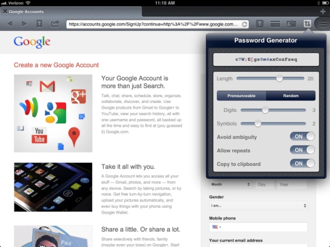
1Password 4.2 Released

1password-4-2.jpg

This is a pretty big update, if you're an iPad owner. Now you can generate passwords right from within the browser (they're calling it "1Browser" now), just as if you were using the desktop app.

They've also added 'Go & Fill' bookmarks to the iPad version, which really streamlines the process of logging into websites, saving you from having to go back-and-forth between 1Browser and the Vault.

The iPhone will be receiving both of these awesome features in a later update, but for now you can still use the other new goodies: the ability to share encrypted logins (be very careful with this) and advanced search functionality.

If you want to get the update now, click here.

'The Story of Ridiculous Fishing'

Polygon put together a nice profile of Vlambeer, the two-man design studio behind Ridiculous Fishing, and the struggle they faced after having their game idea cloned. I enjoyed learning that their relationship mirrors that of The Odd Couple.

“Vlambeer's origin story sounds like the start of a romantic comedy. They met on a train, hated each other instantly, then, over the course of a slow and argumentative year at school together, came around.”

Go read the story, then buy the game if you haven't already. You're a crazy person if you don't.

Status Board for iPad

Three years and one month ago, the guys at Panic (one of my favorite Mac/iOS development studios) unveiled a cool project for their office: the Panic Status Board. It contained all kinds of useful and up-to-date info concerning:

  • Ongoing projects (deadlines, who's working on what, etc).
  • The number of support emails that are queued up for each of their apps.
  • The office calendar.
  • A revenue tracker.
  • Even a local bus route schedule.

And what kinds of results did they see in the office after putting up the Status Board? Here's how they described it:

"Magic is Hard"

Khoi Vinh:

“To simplify is huge, but what matters just as much is the end result, what the user gets out of the simplification. If the simplified process produces satisfactory results, great. But it’s magic when the software generates a disproportionately meaningful output from that minimized input.”